Life Time Digital Sales Tool
Prototyping, Usability Studies, UX/UI/Visual Design

Life Time’s presale centers were falling short in delivering an on-brand experience to prospects. I worked directly with corporate sales teams over the coarse of 6 months to design and deliver a digital sales tool to 8+ locations across the U.S.
What I did
Rapid Prototyping
UX/UI Design
Visual Design
Usability Studies
Qualitative Interviews
Some Copywriting
Tools
Sketch
Invision
Touch-enabled Samsung Displays
Agency
Done while at Life Time
The Problem
Within the sales experience, the presentation of the club was identified as the primary pain point/key problem area. Marketing support to the presale sales staff was often inaccurate and consistently shallow relative to the options members would have with their membership.
The solution needed to serve two groups in distinctly different ways. The sales teams needed a simple, functional tool that empowered them to tailor each presentation to prospects interests. Prospects needed club-specific accuracy across the entire spectrum of the Life Time member experience.

The Solution
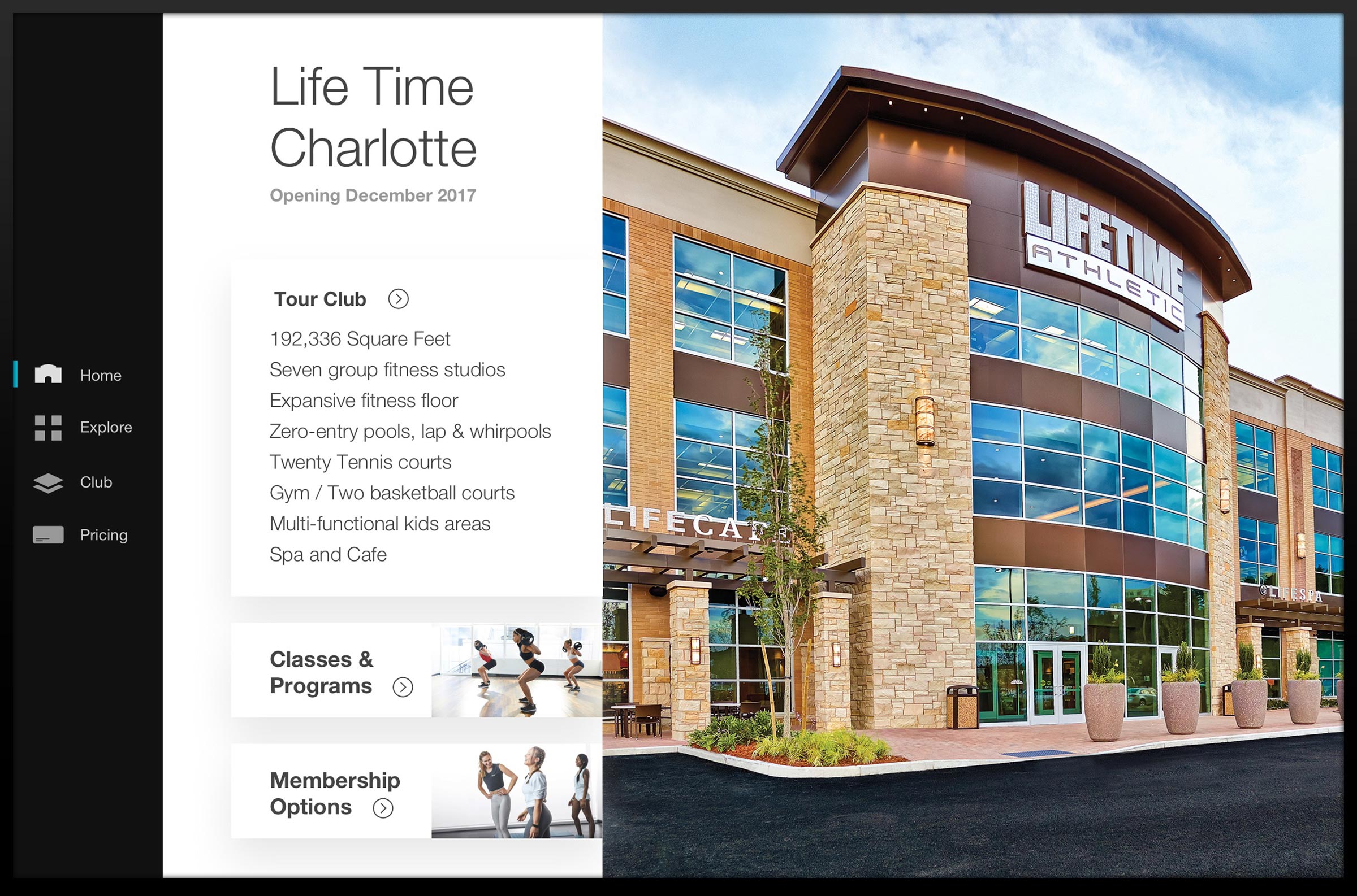
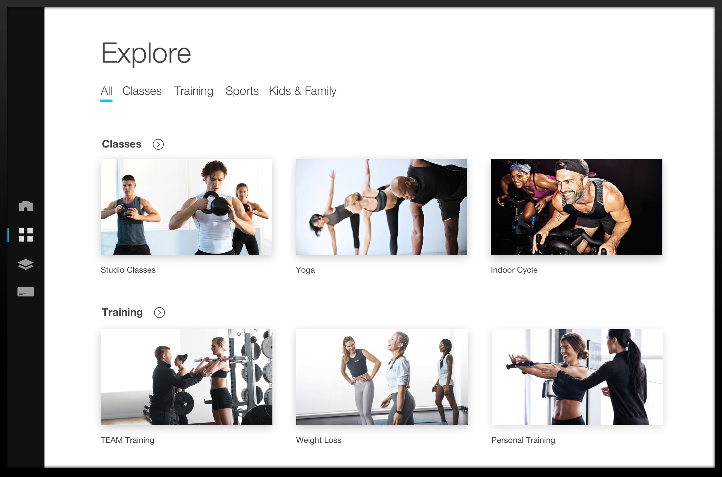
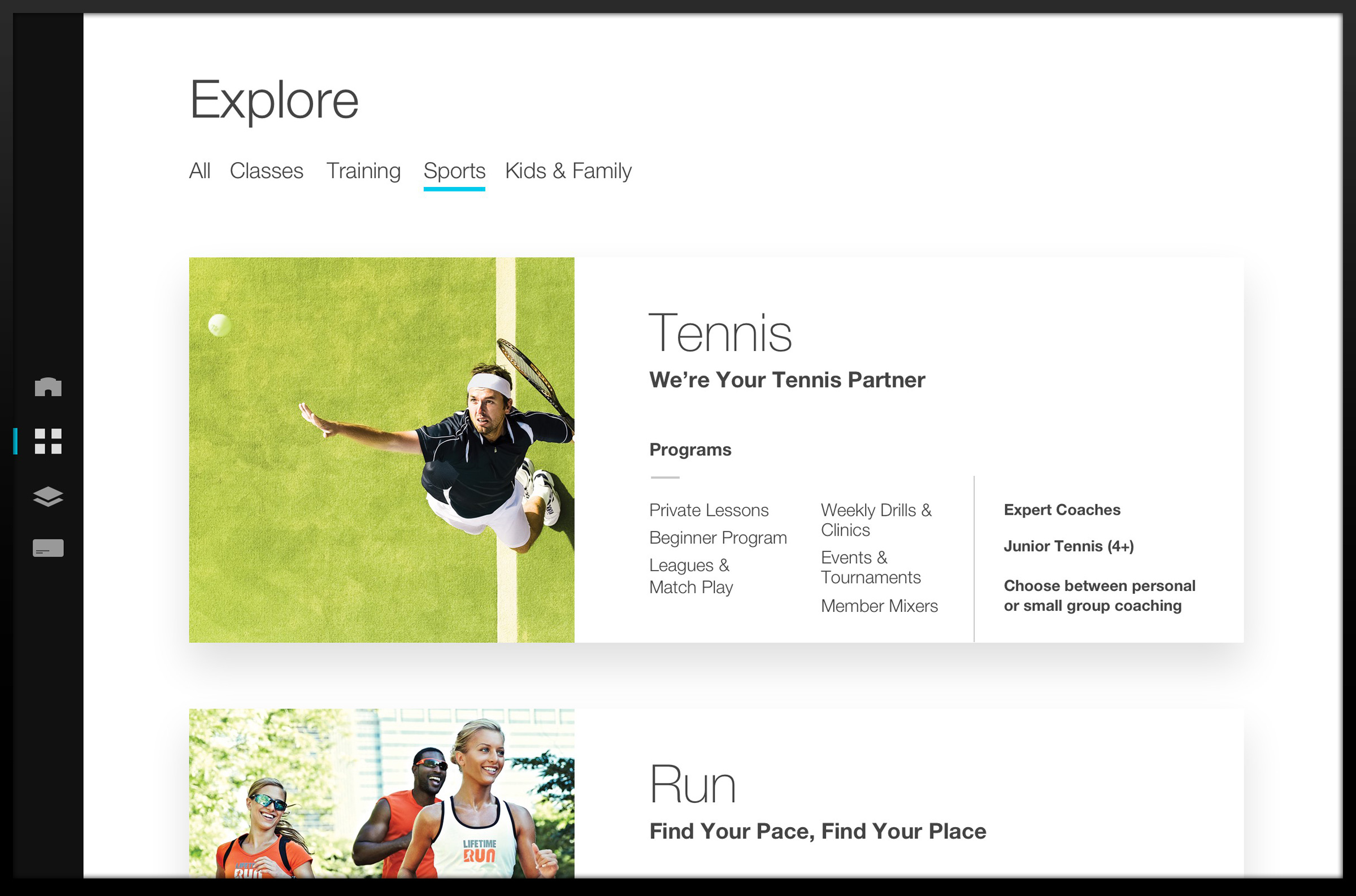
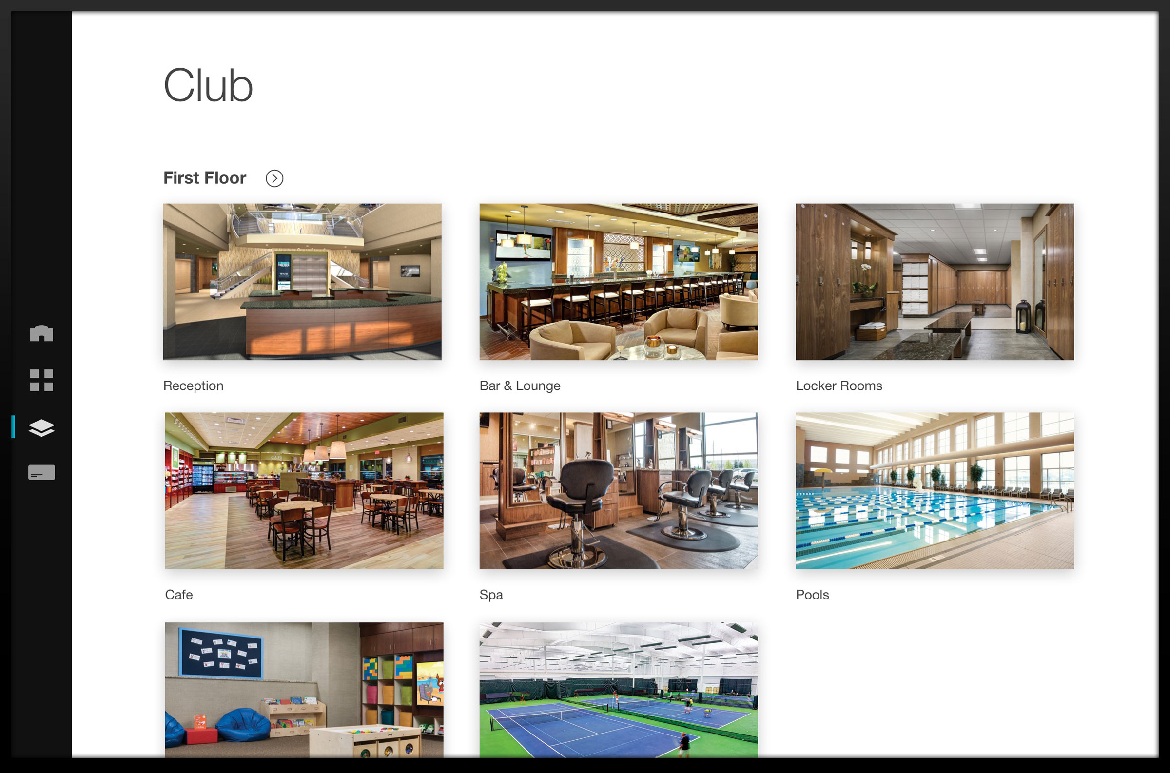
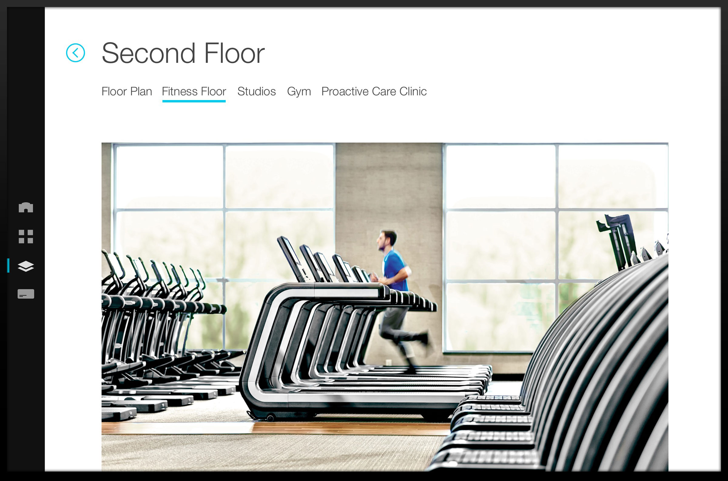
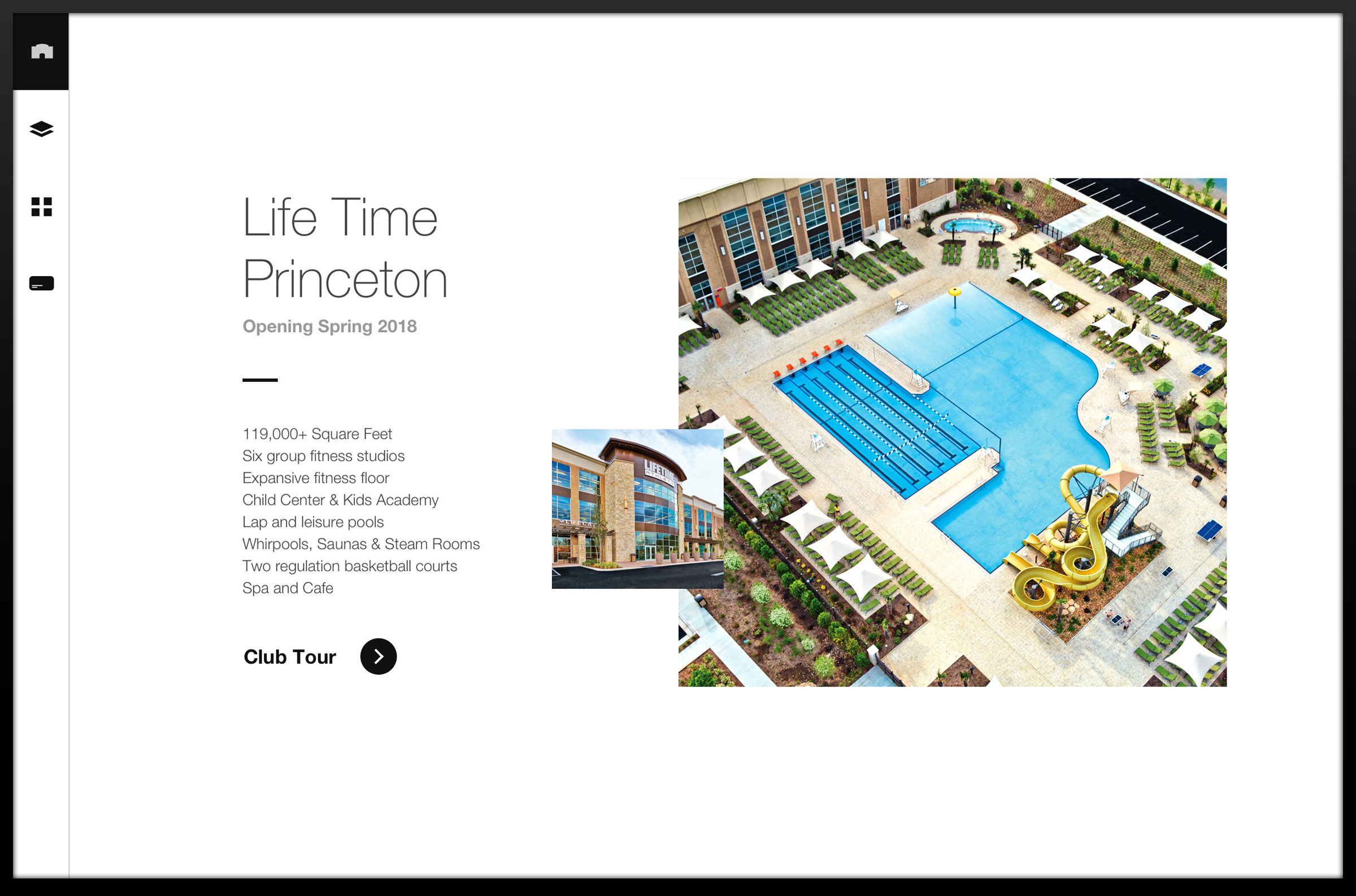
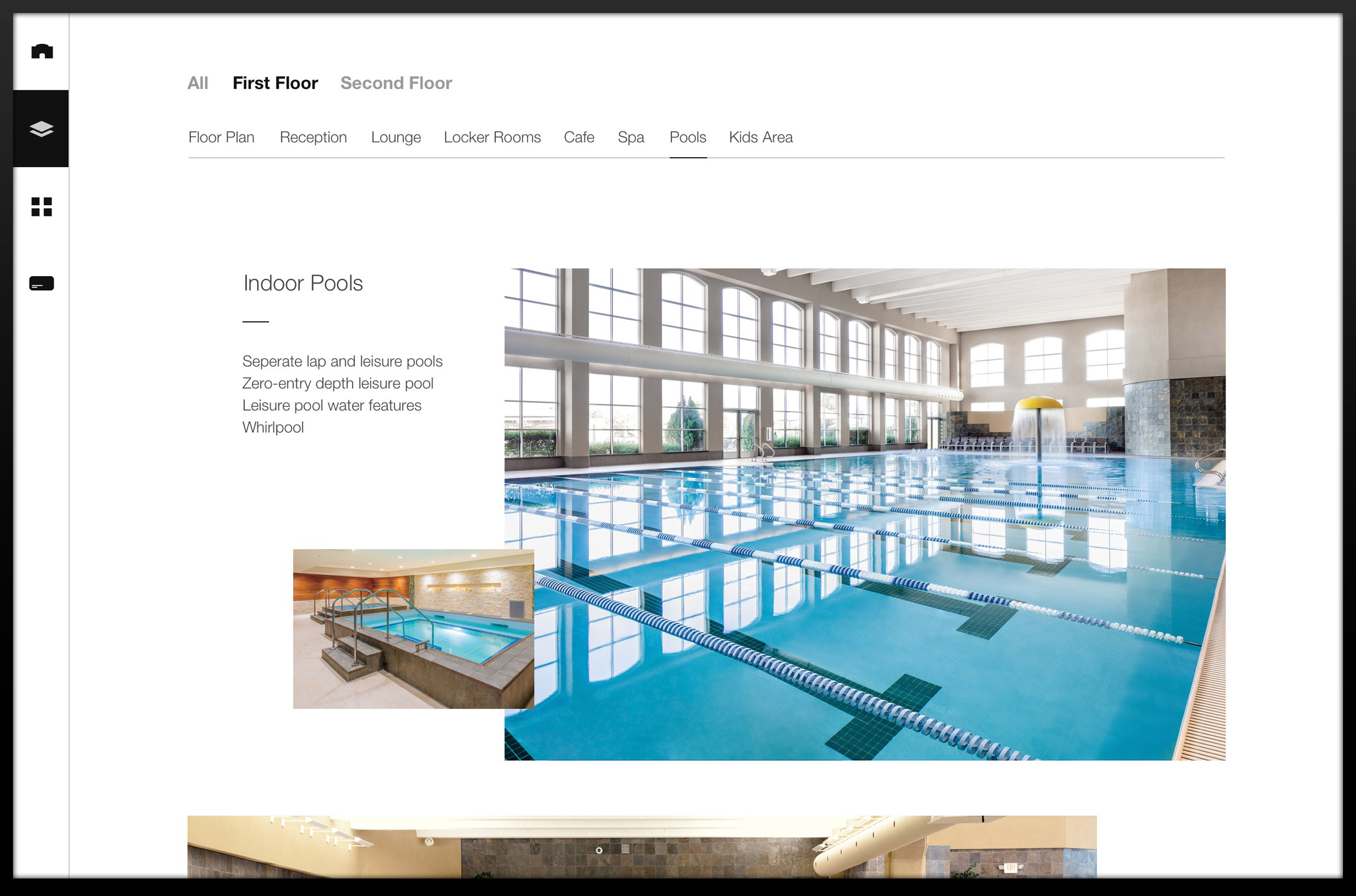
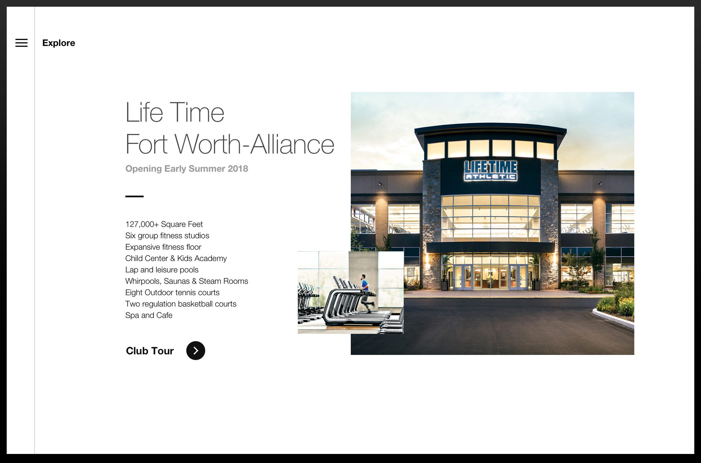
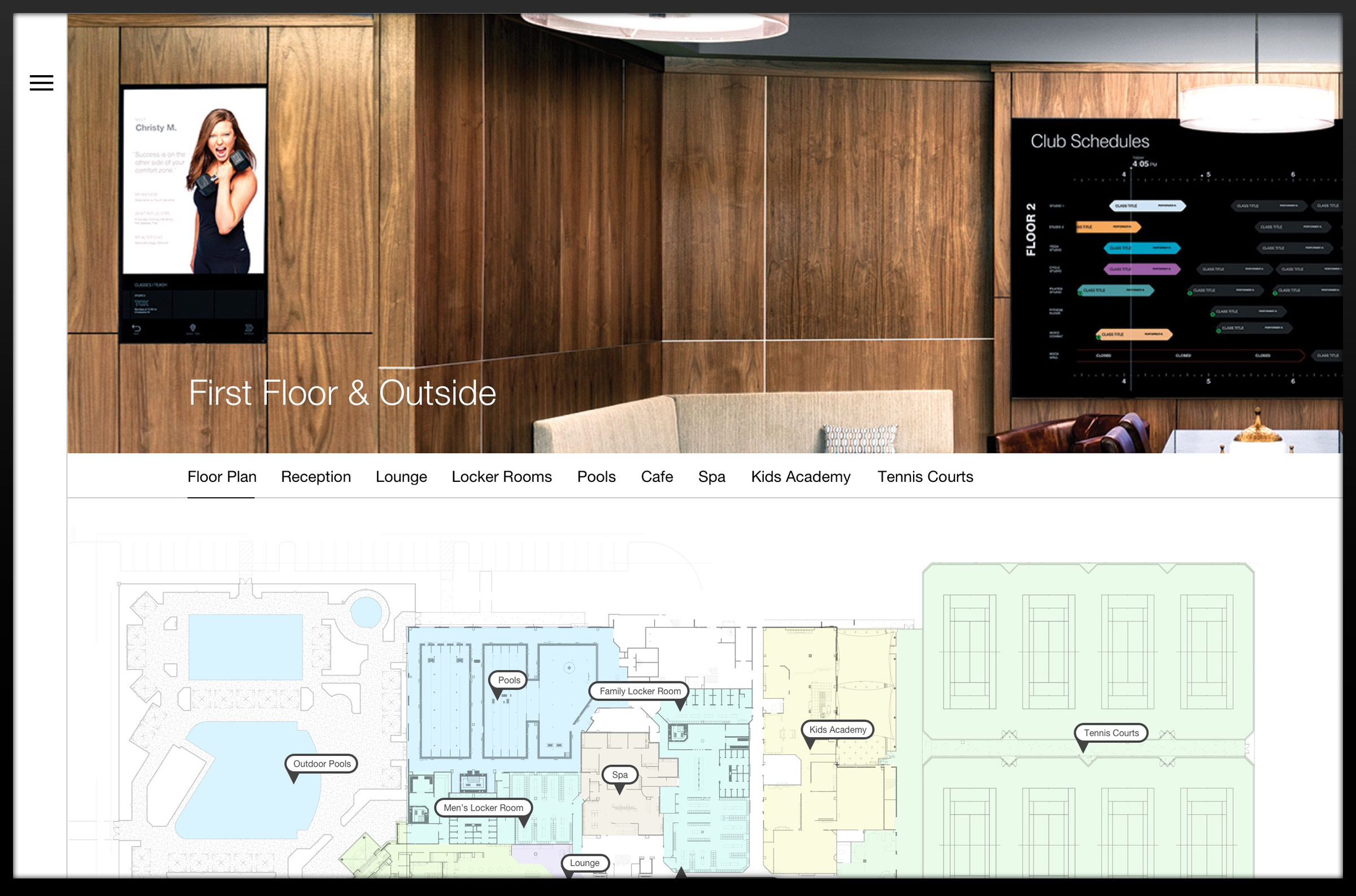
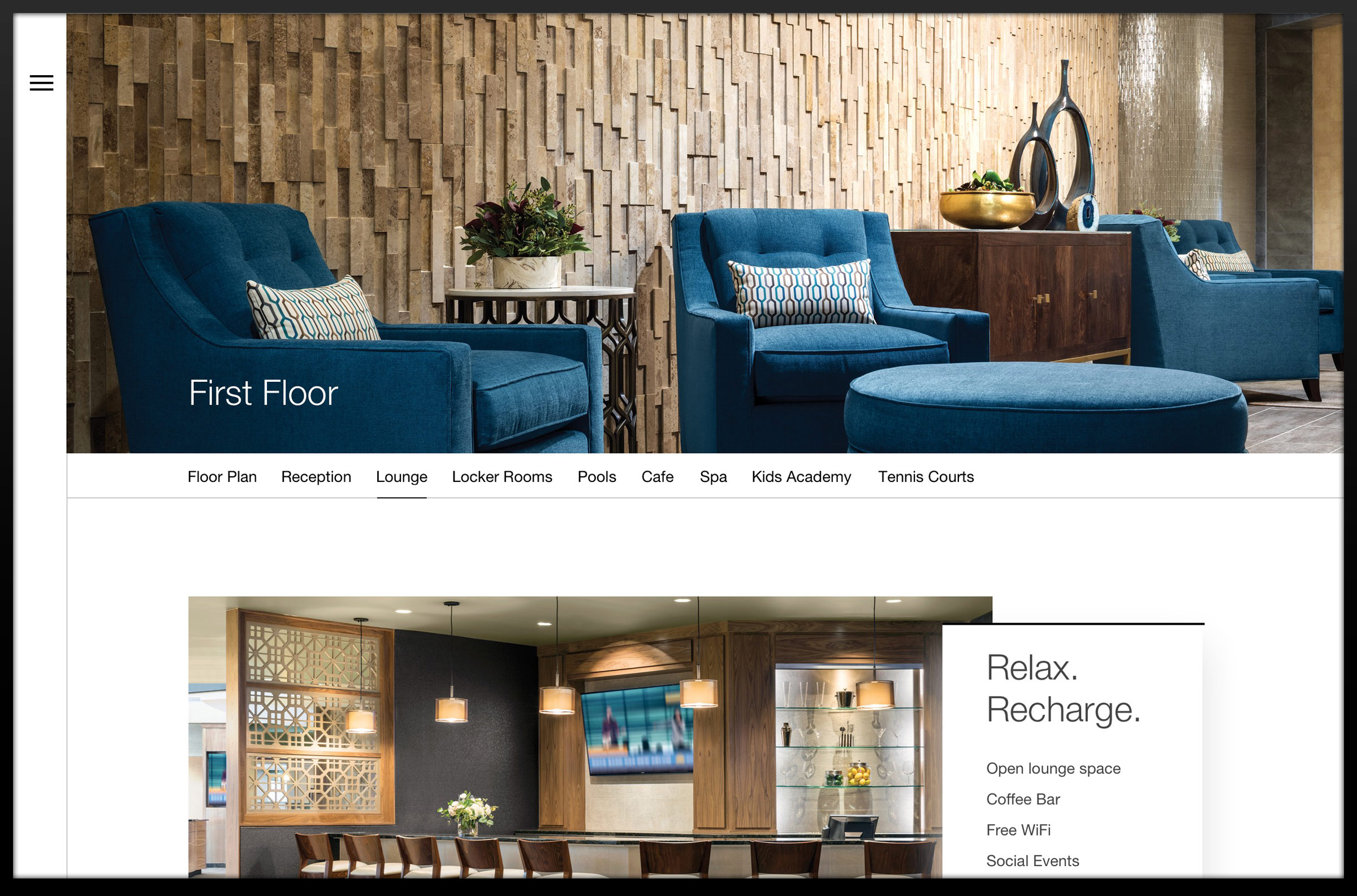
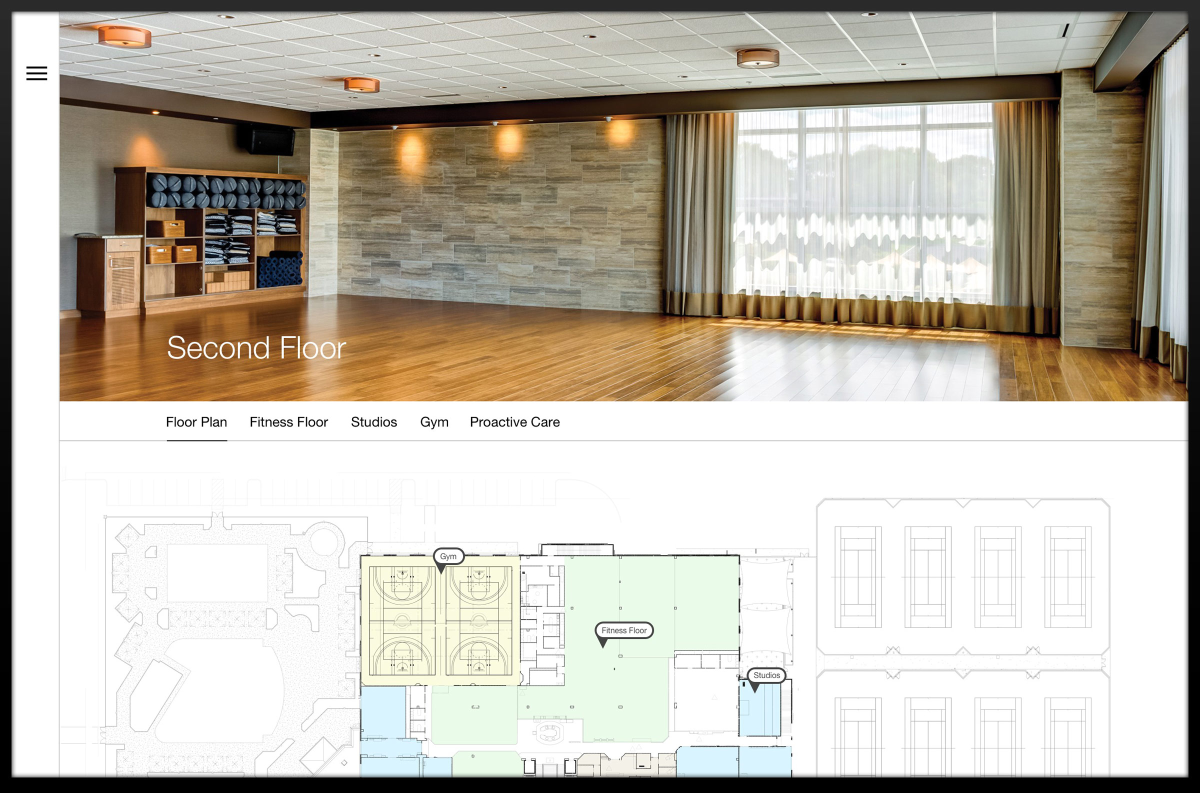
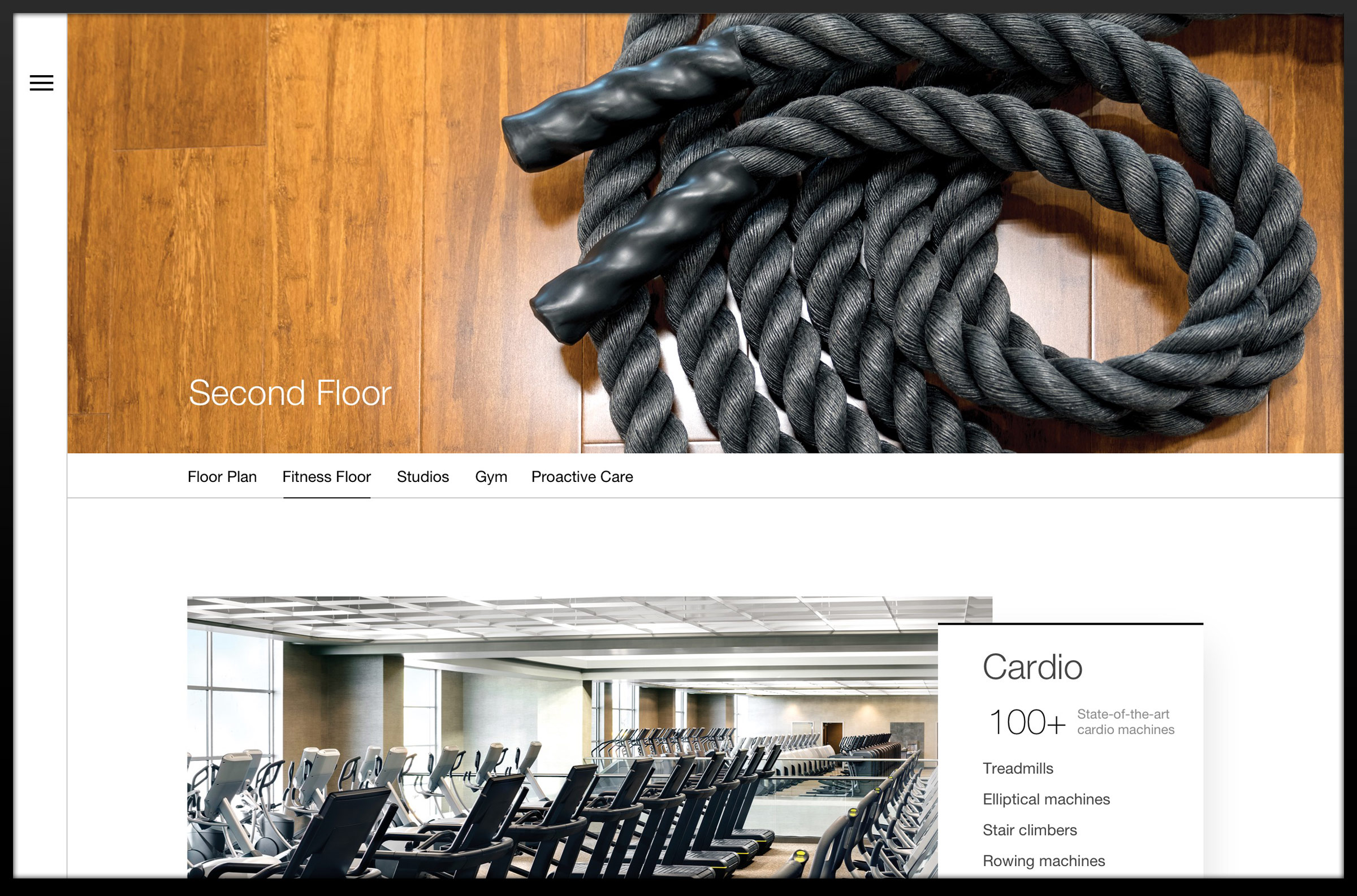
Fully-functional, digital prototypes were deployed to wall-mounted, touch-enabled smartTV's at each pre-sale location. This gave the sales staff a cinematic, highly accurate and customizable presentation while accelerating project delivery and laying the groundwork for future user-centric design iterations.
1st Prototype
Speed to Market
The first prototype went broad and shallow with programs and amenities. This allowed faster delivery to the first two presale locations – Charlotte, North Carolina and Franklin, Tennessee. User experience considerations focused on the reach radius of sales staff with the 55 inch Samsung, touch-enabled displays.
TRAVELED TO
2
presale centers
obsererved
20
sales appointments
interviewed
6
Sales staff
2nd Prototype
Improved Navigation & Program Pricing
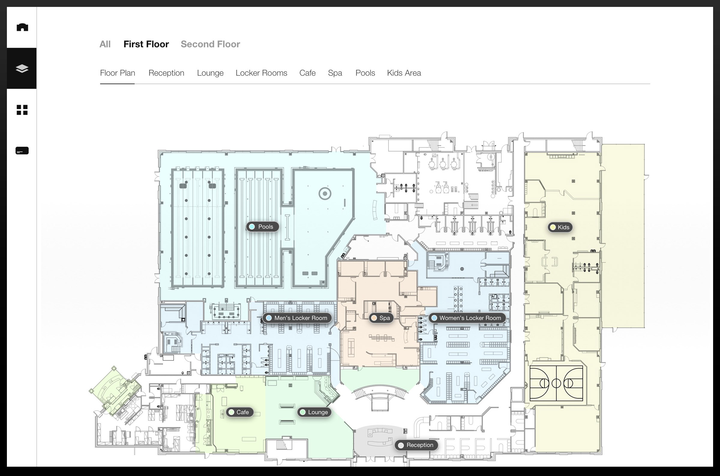
Based on user behavior of the sales staff from Charlotte and Franklin, the Floor Plan interface was enhanced. The secondary navigation was overhauled to reduce ping pong'ing between areas within primary sections.
The second prototype also began to address the issue of full pricing transparency. I worked with national program managers to add pricing for programs not included with memberships.
TRAVELED TO
1
PRESALE CENTER
obsererved
14
sales appointments
interviewed
2
sales staff
3rd prototype
Deeper Content & Answering Prospects Common Questions
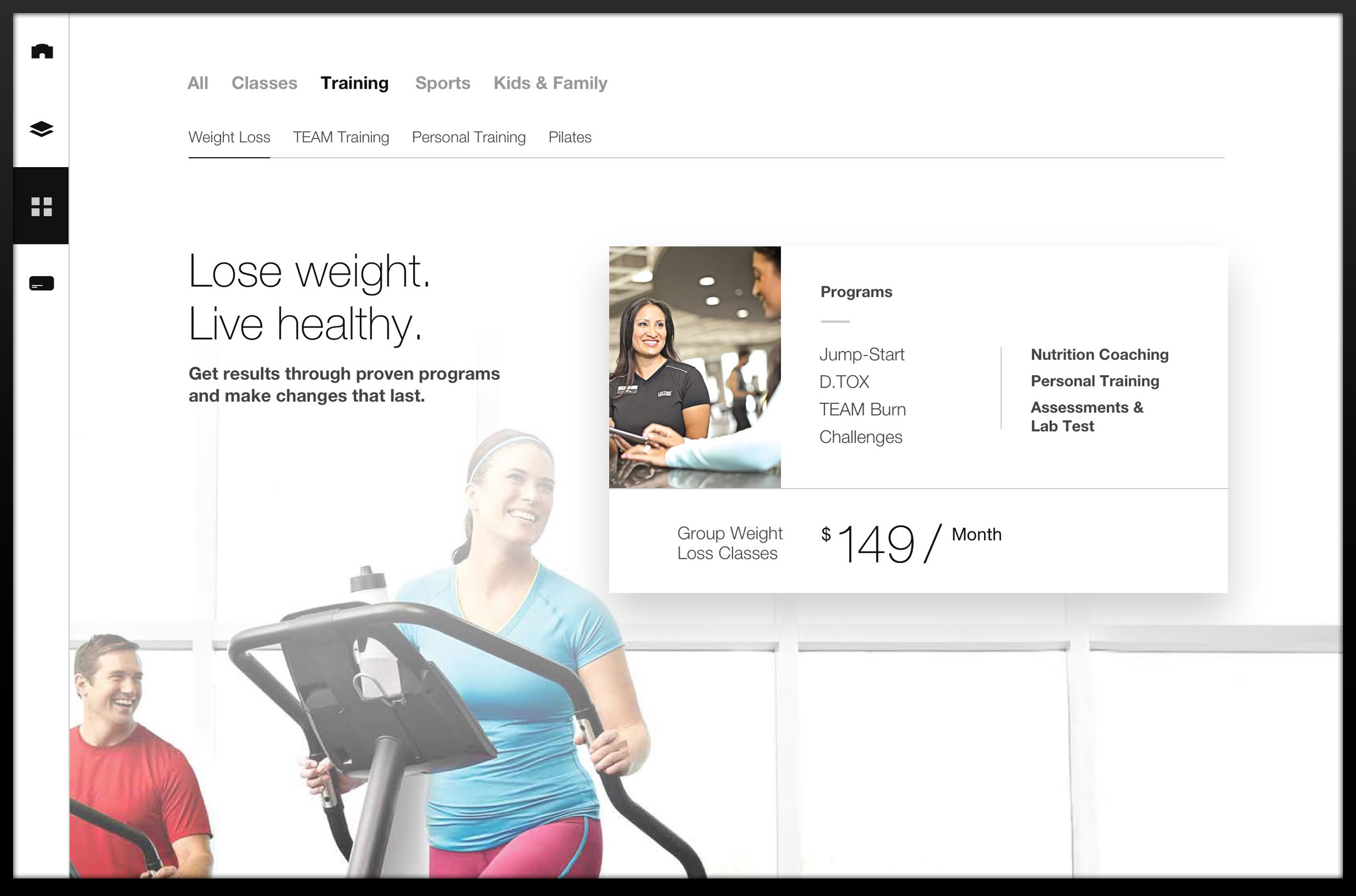
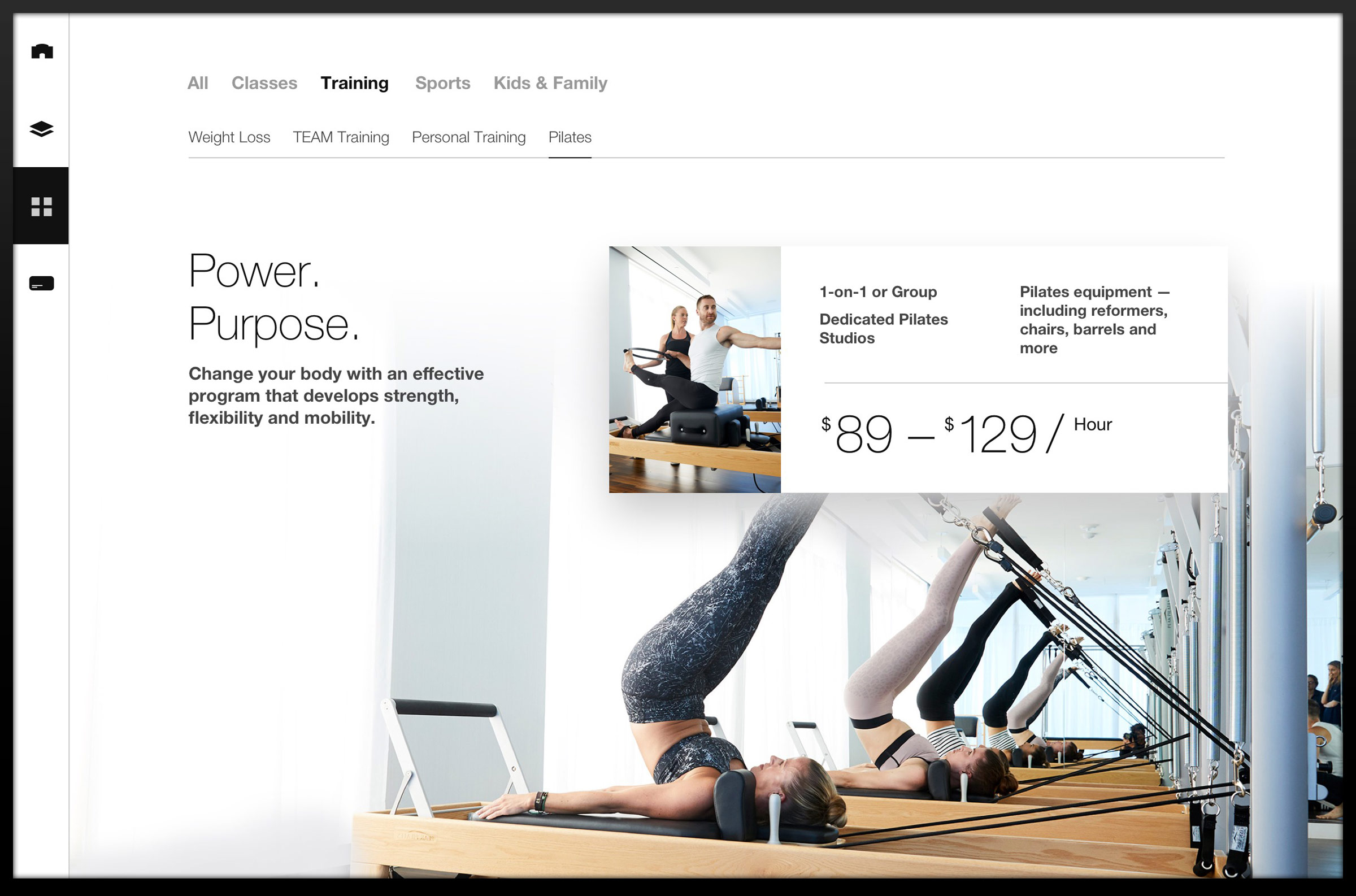
The third prototype took a step forward with deeper content across all pages and more complete program pricing.
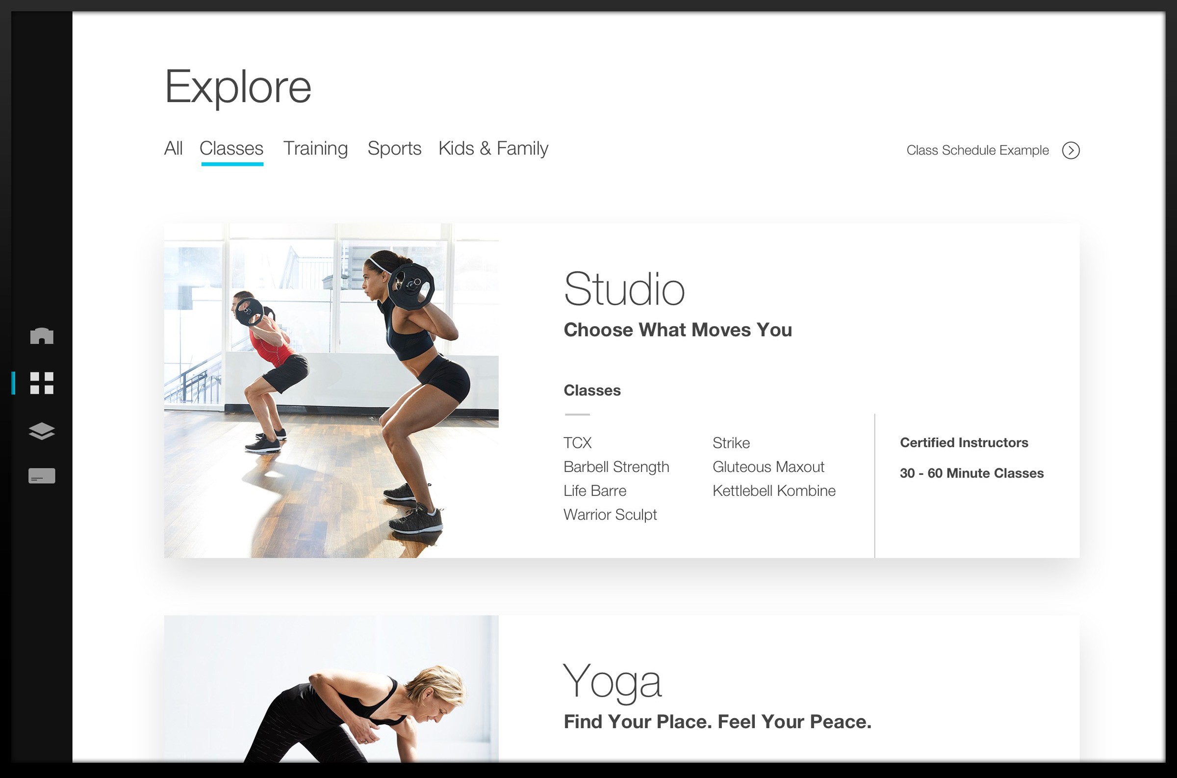
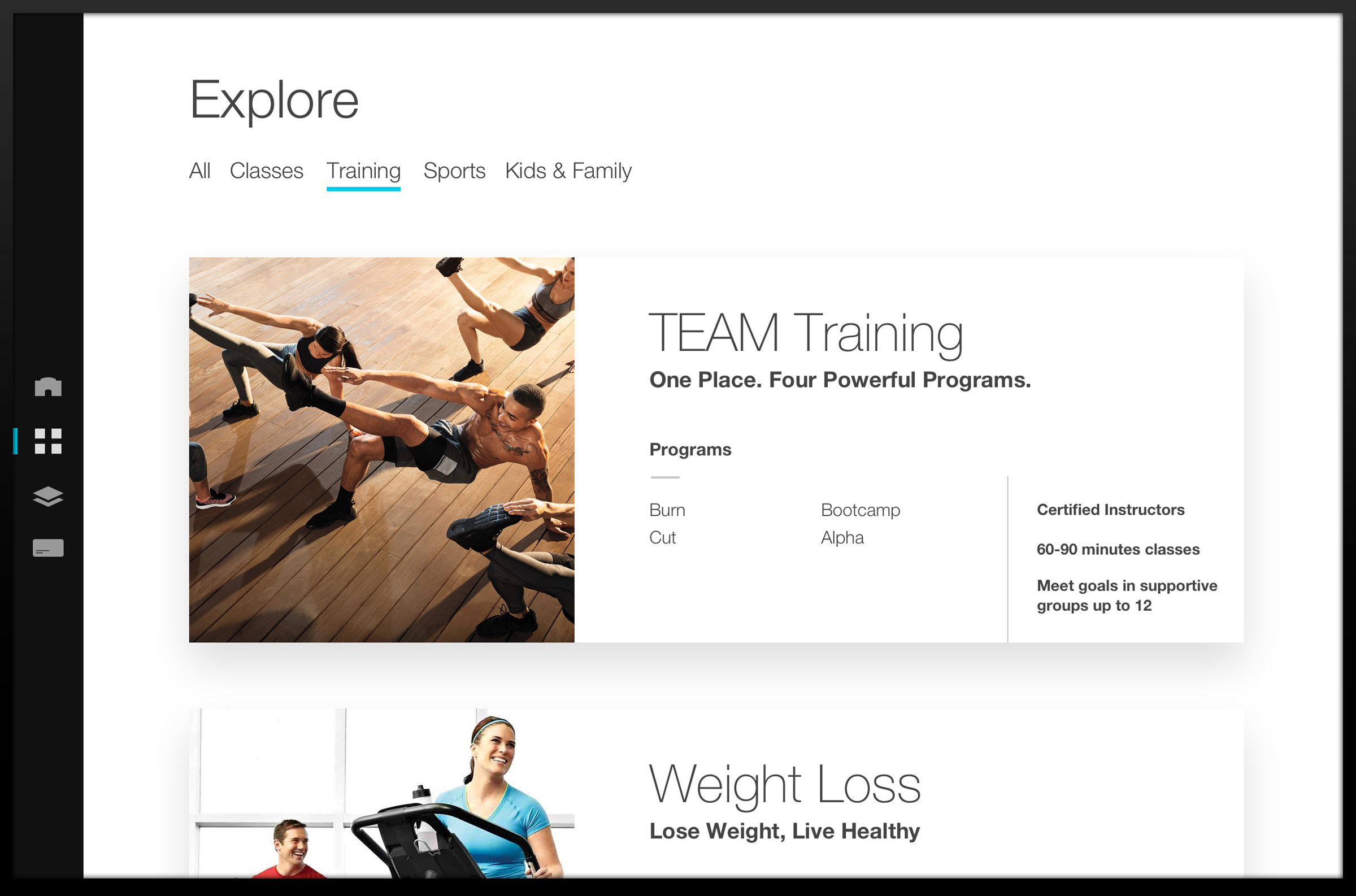
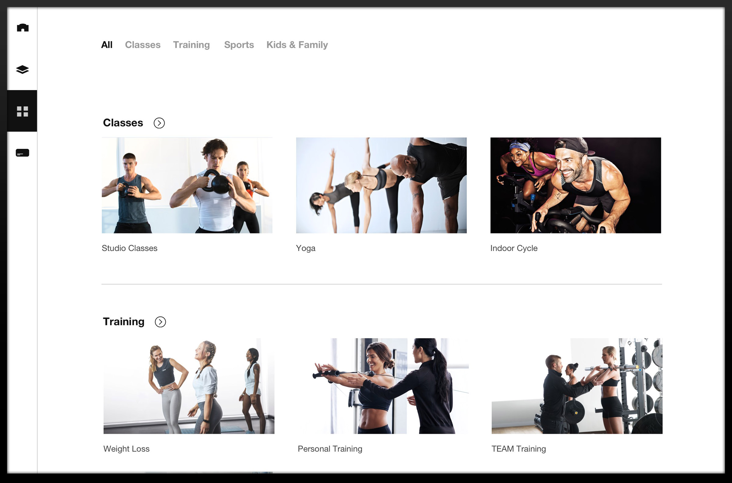
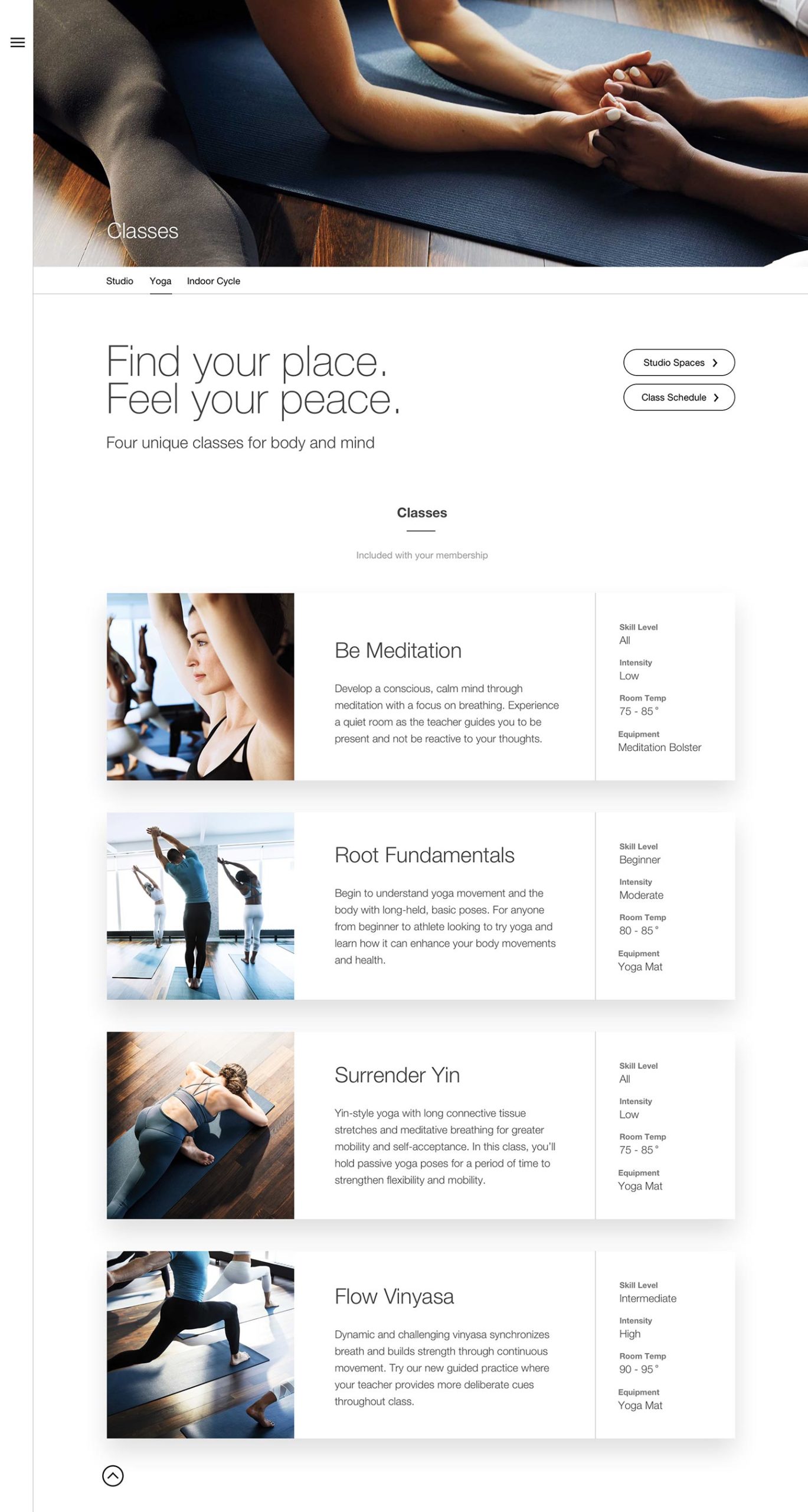
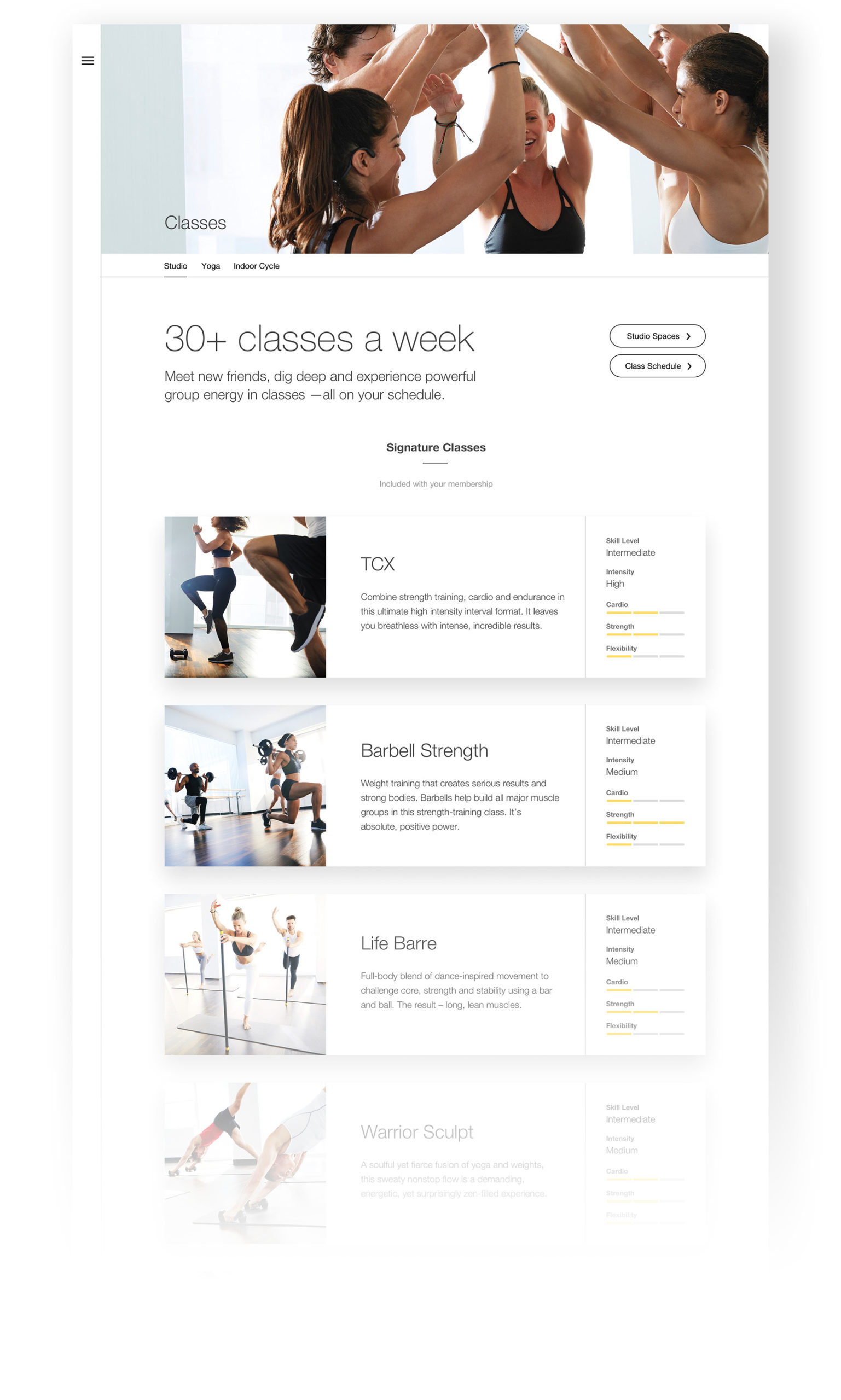
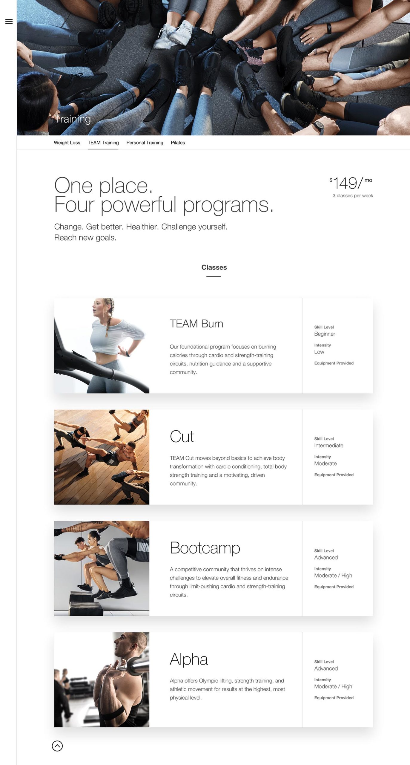
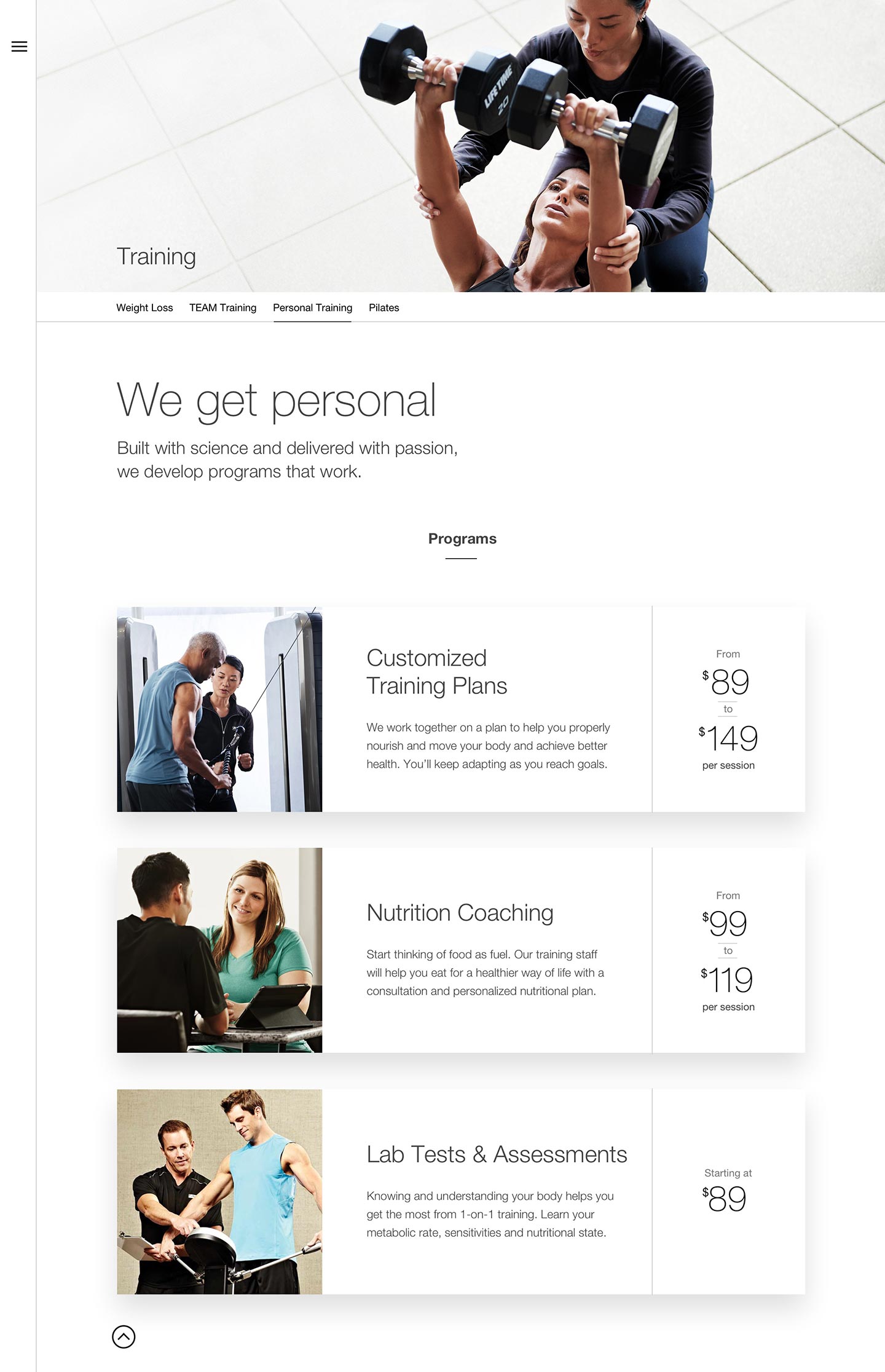
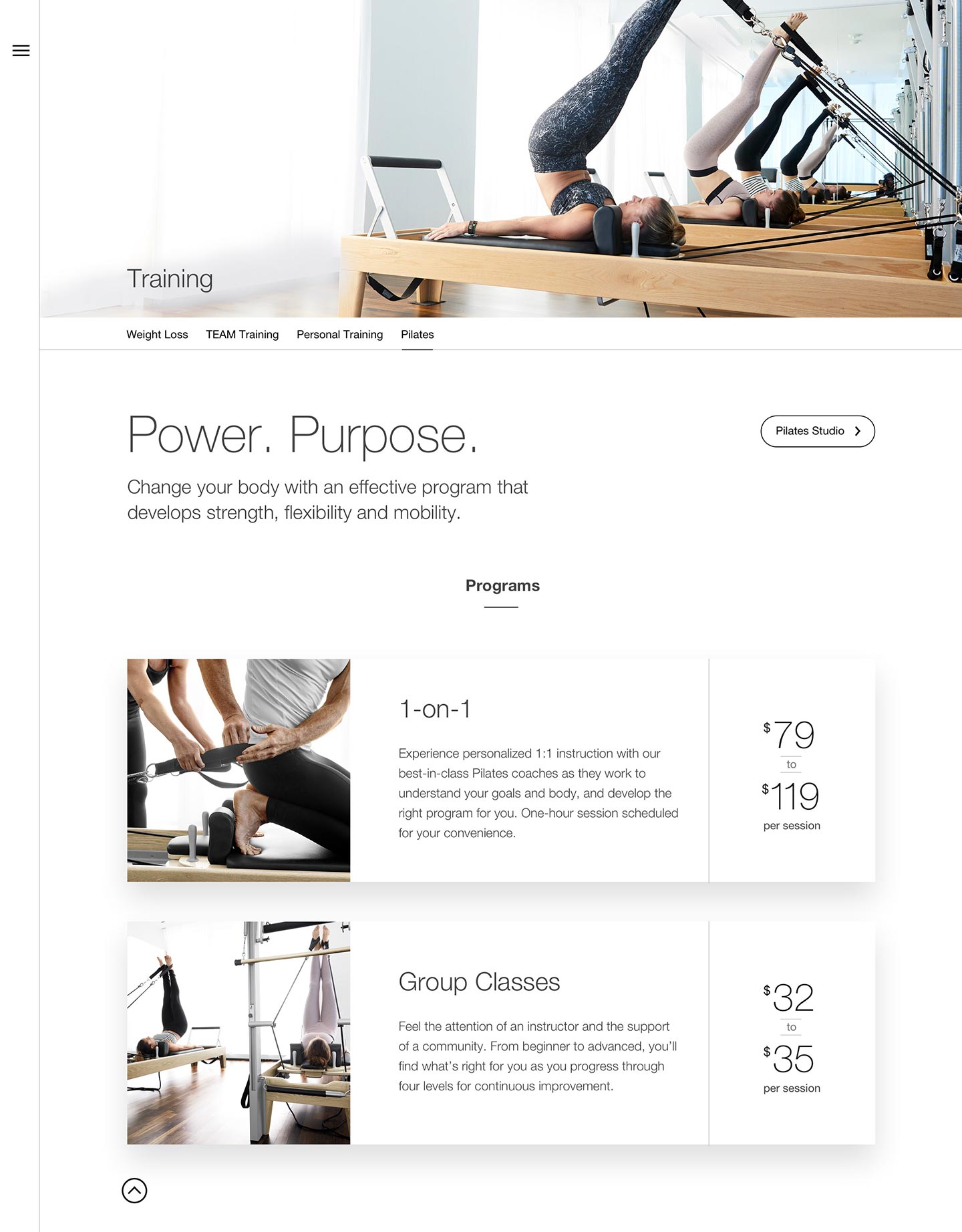
Training & Class Pages
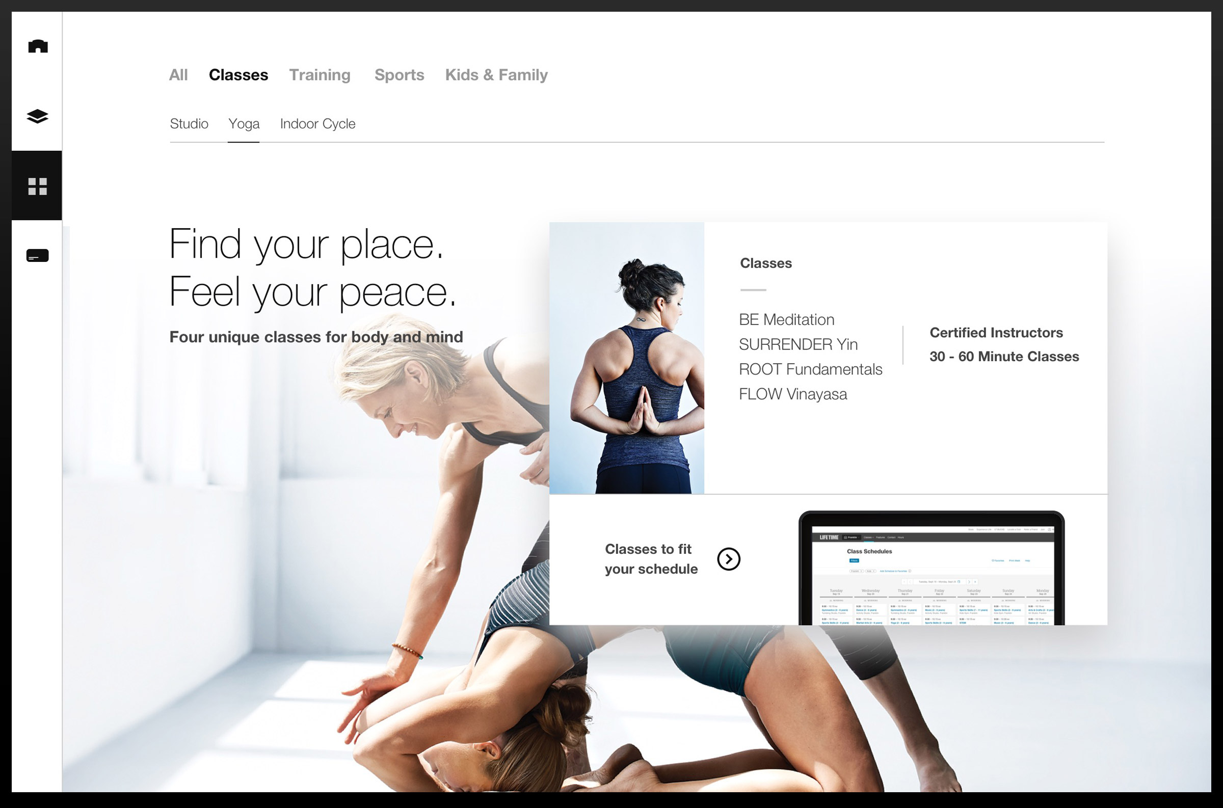
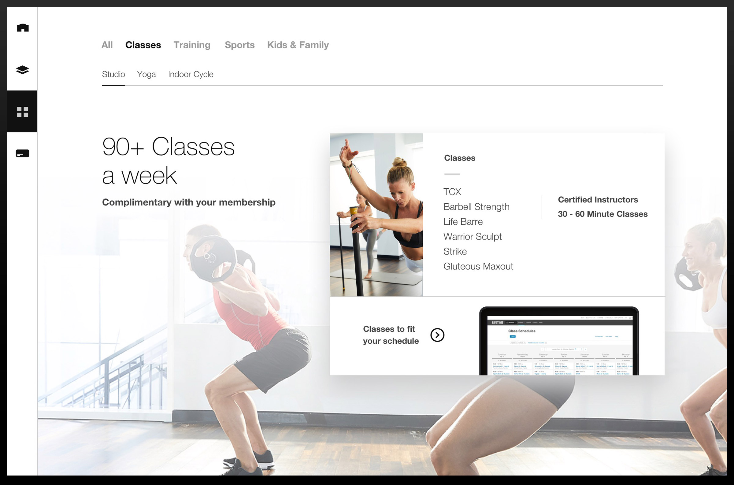
Expanded class pages arm the sales staff with sufficient details for the novice to the extreme workout enthusiasts.
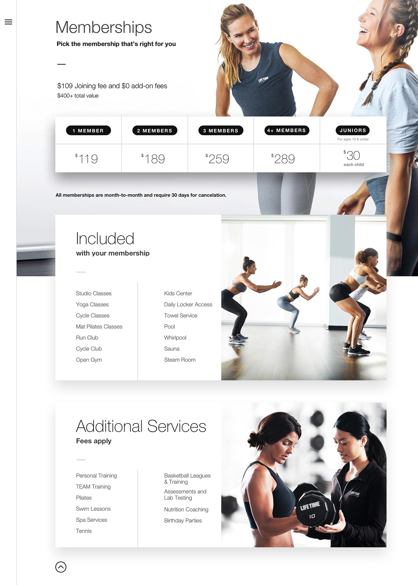
Closing the Sale
The membership page improved upon the existing pricing sheet by listing items included with memberships and those where additional service fees apply.
STUDIO
CONTACT
FOLLOW
All work © Hybrid Studio, LLC
