Way
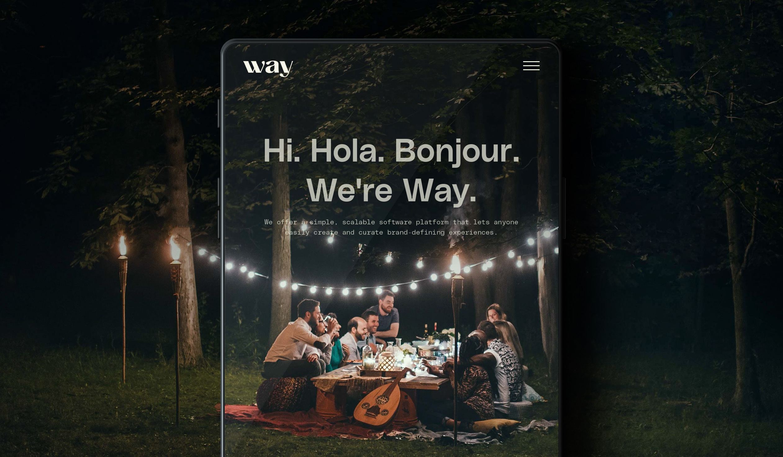
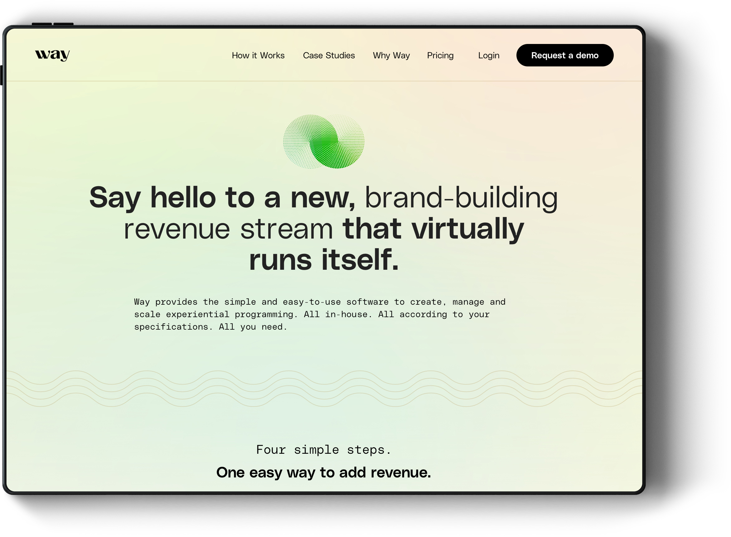
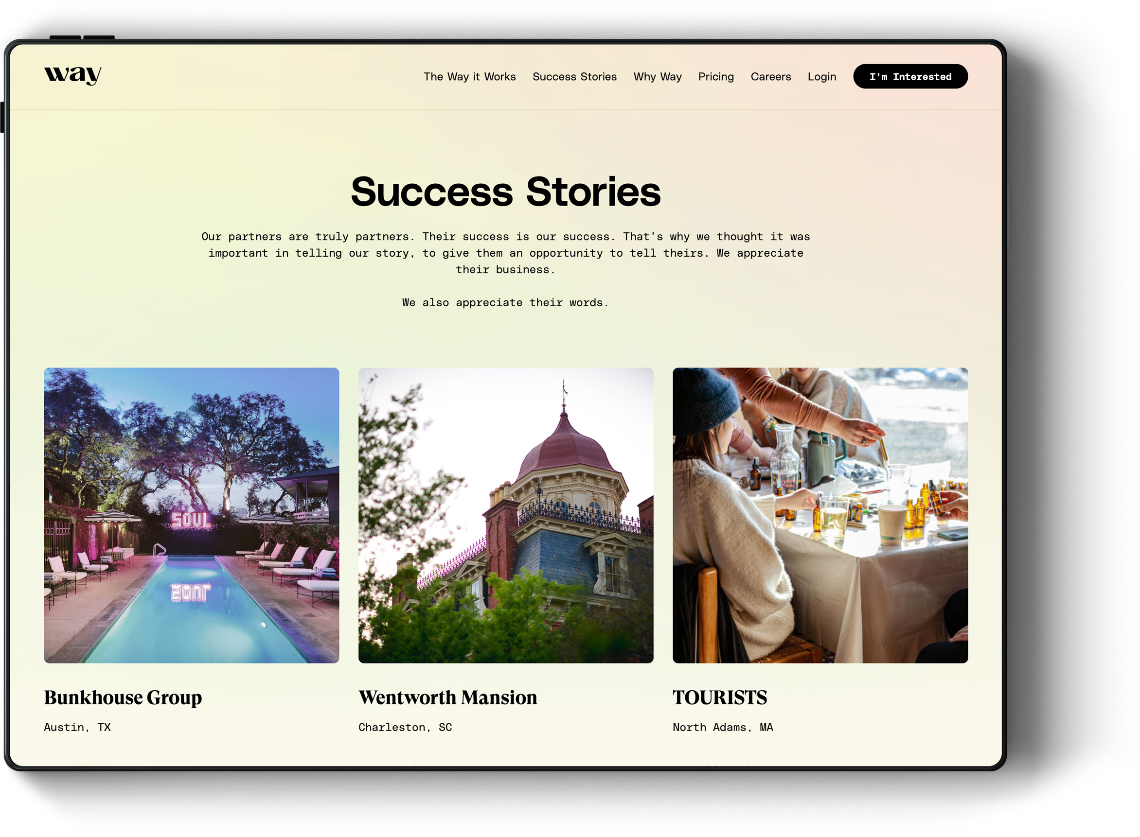
Way offers a simple, scalable software platform that provides hotels and resorts the power to create and curate unique guest experiences.
Over the the span of 5 months, writer/creative director Troy Longie and I worked closely with Way's founders to re-imagine their web site and build their brand from the ground up.
Services Provided
Brand Identity
UX/UI
Digital Design
Deliverables
Logo
Web Site
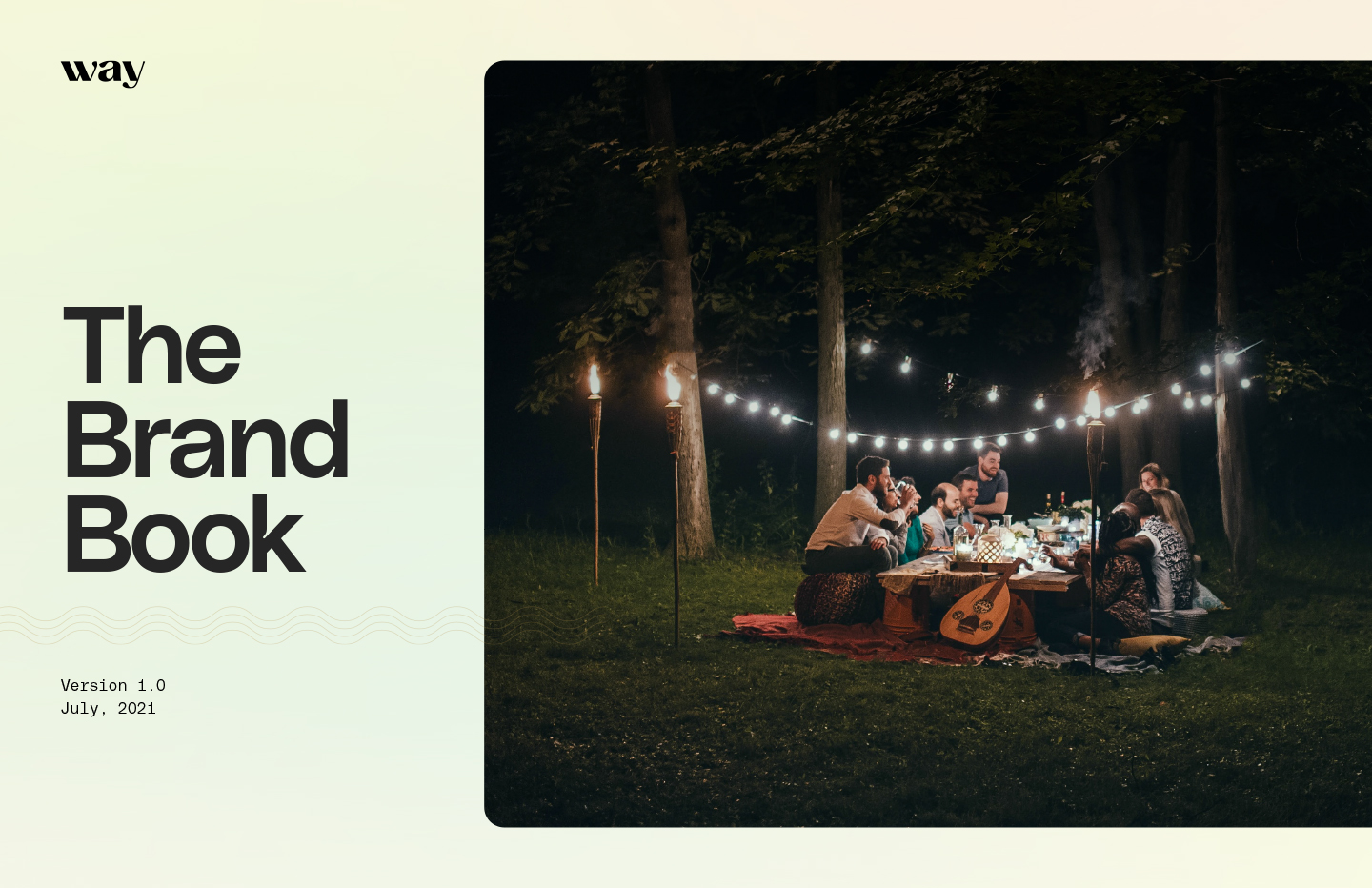
Brand Book
Team
Writer — Troy Longie
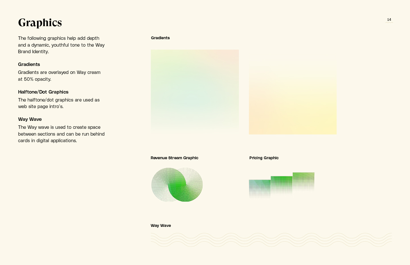
Logo Development
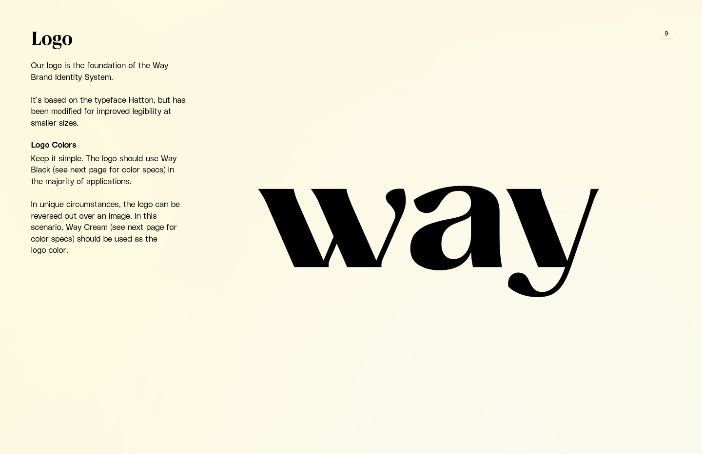
The concise company name and and a lightweight budget pushed the logo concepts towards simple, clean wordmarks focused on typographic details.
01
Typefaces with these general characteristics are commonly more vertical.
02
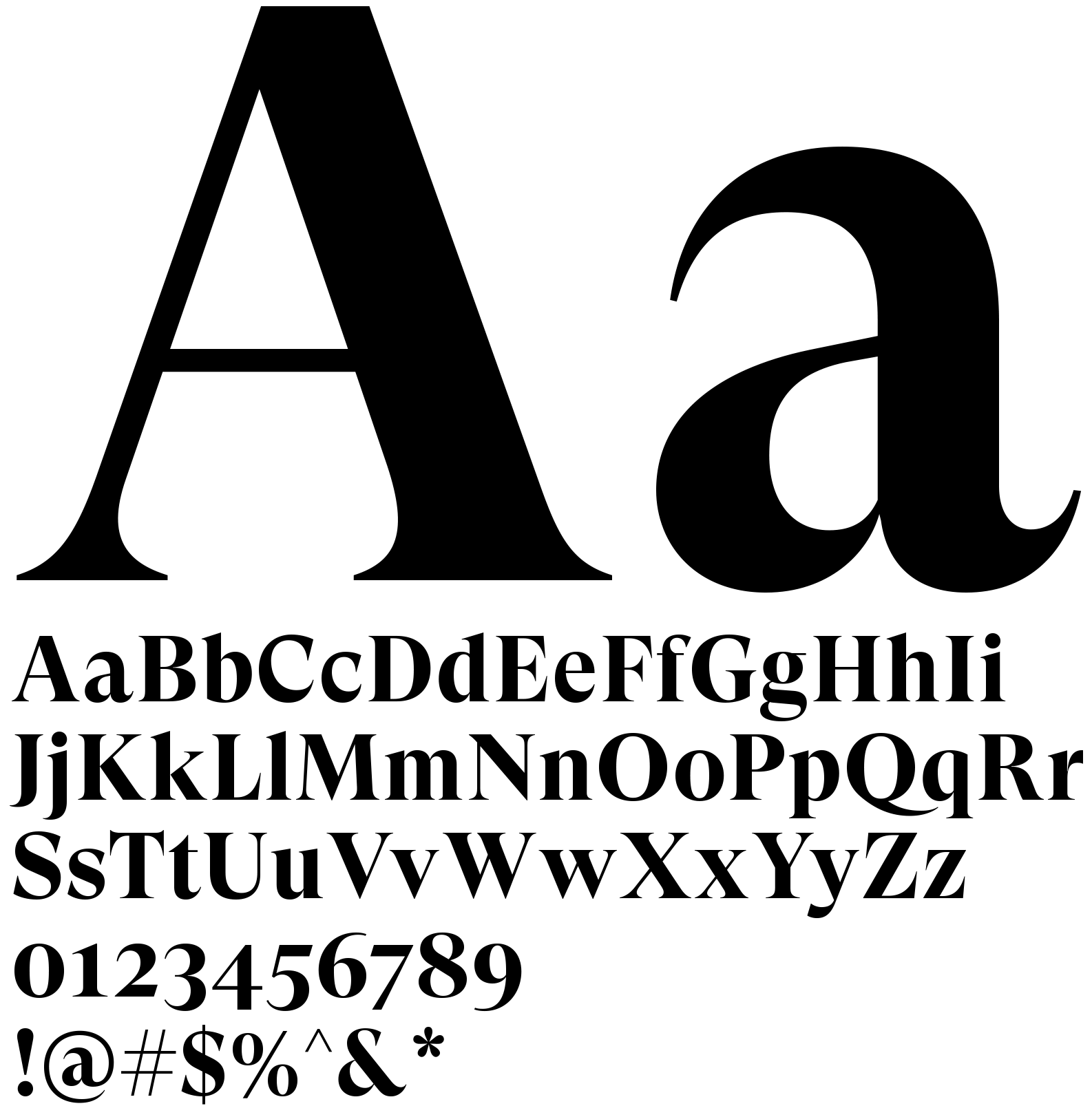
Abrupt, high stroke contrast (between thick and thin) references calligraphy and “Didone” typefaces which are often used with premium brands.
03
Wide, flowing terminals. Terminals are commonly much more round.
01
Match “v” shaped angles on “w” and “y”.
02
Sloping, elongated curves
01
Extreme contrast in thick/thin stroke weights.
02
Extra large terminals.
Photography
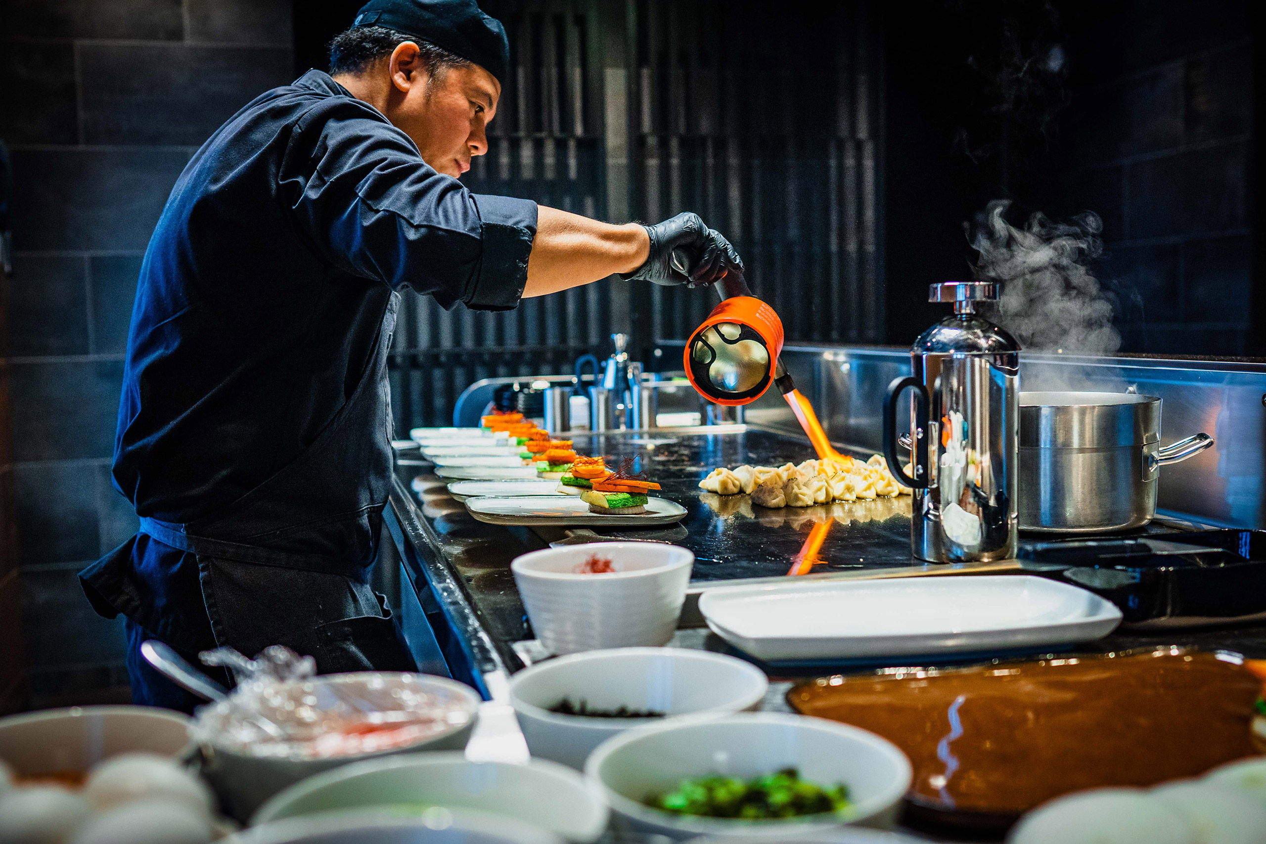
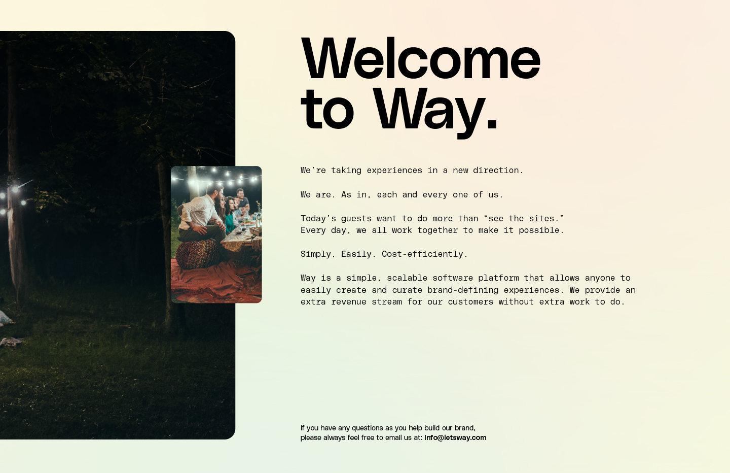
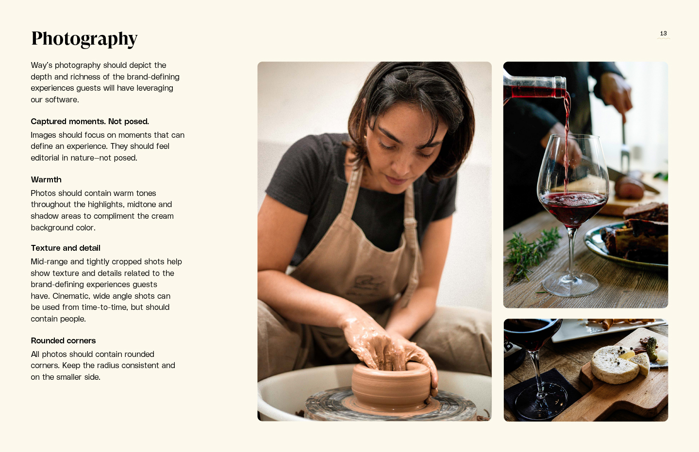
Highly curated stock photography was chosen based on popular host services. Deep, vibrant image color expresses the richness of experiences offered through Way.


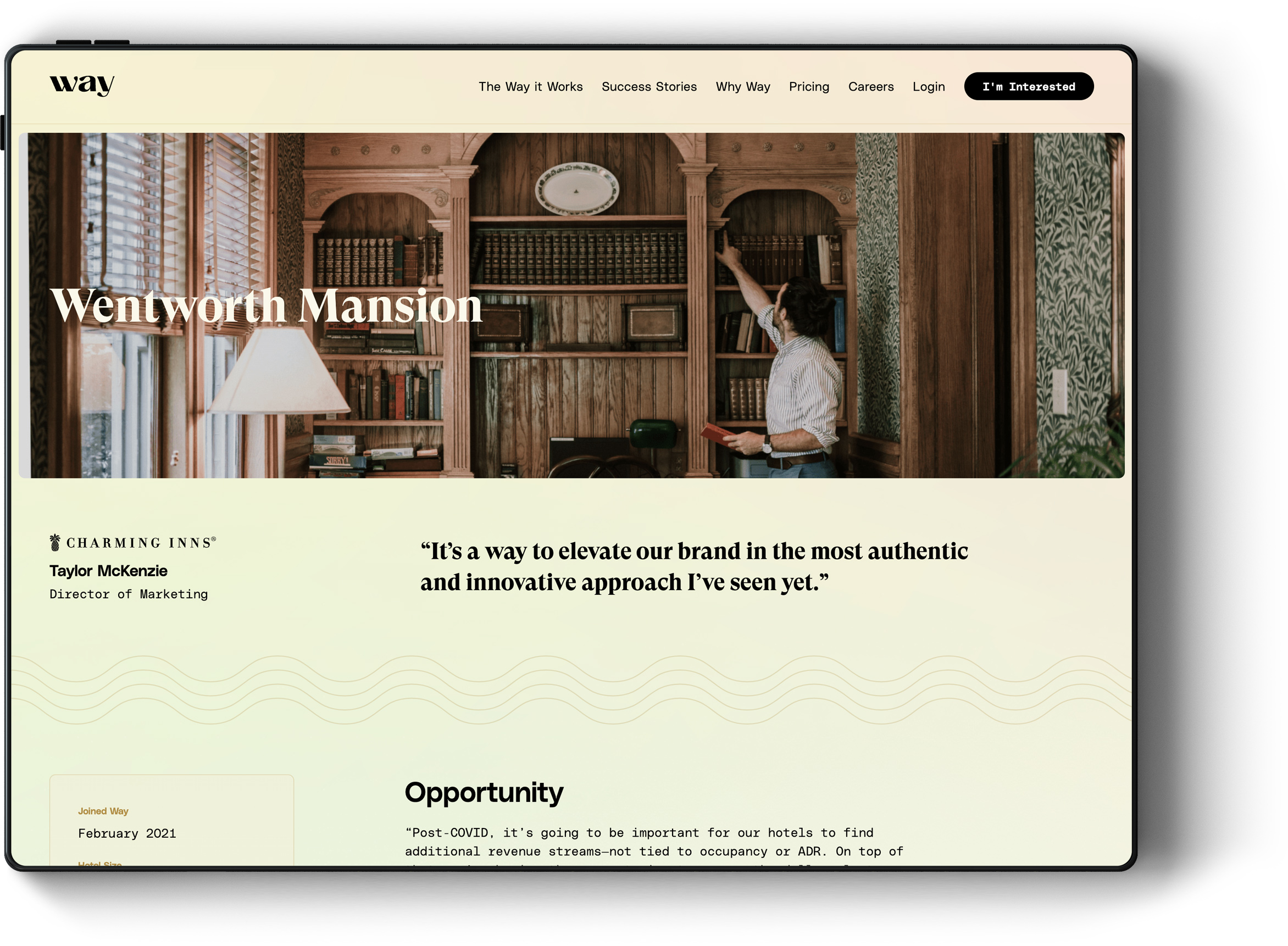
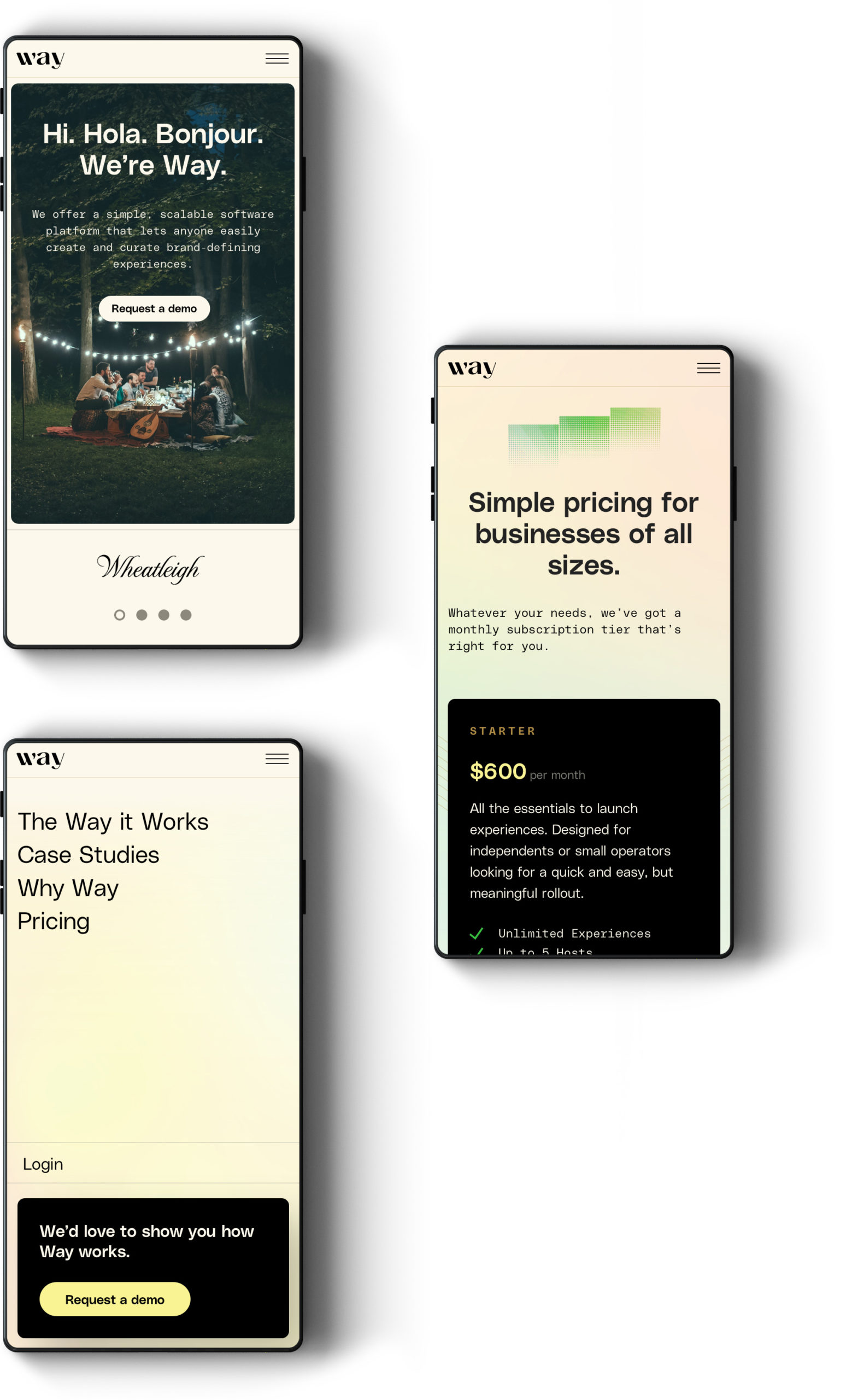
Digital Design
Partnering with the Way team on development, we created a digital experience aimed at driving sales leads and shortening demo times.
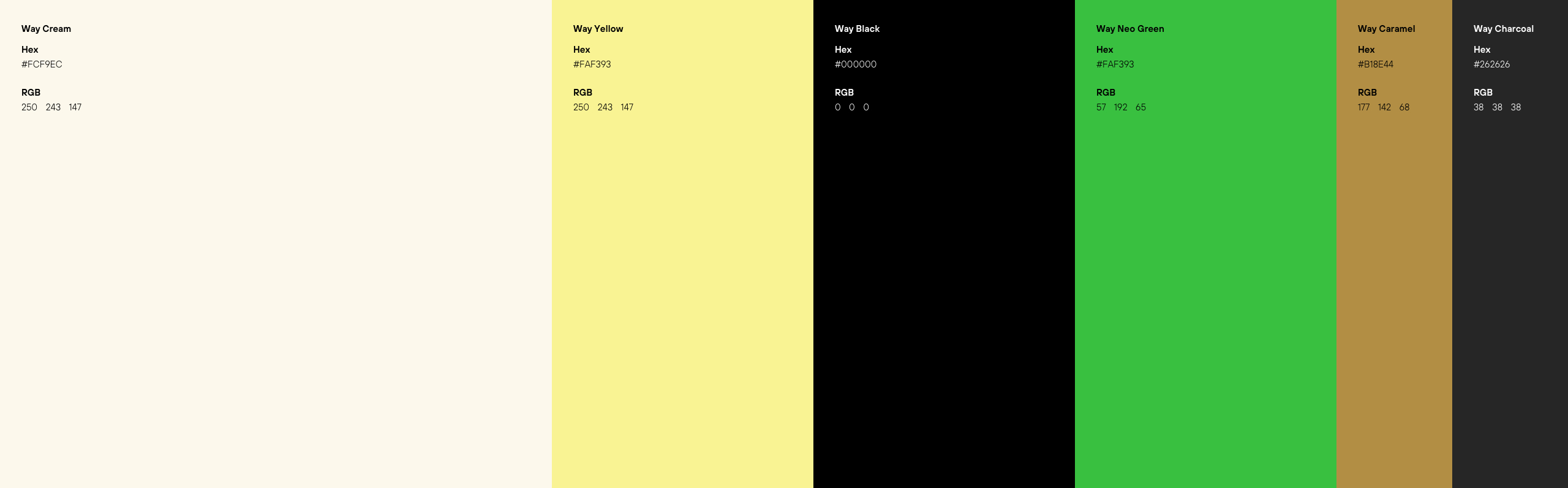
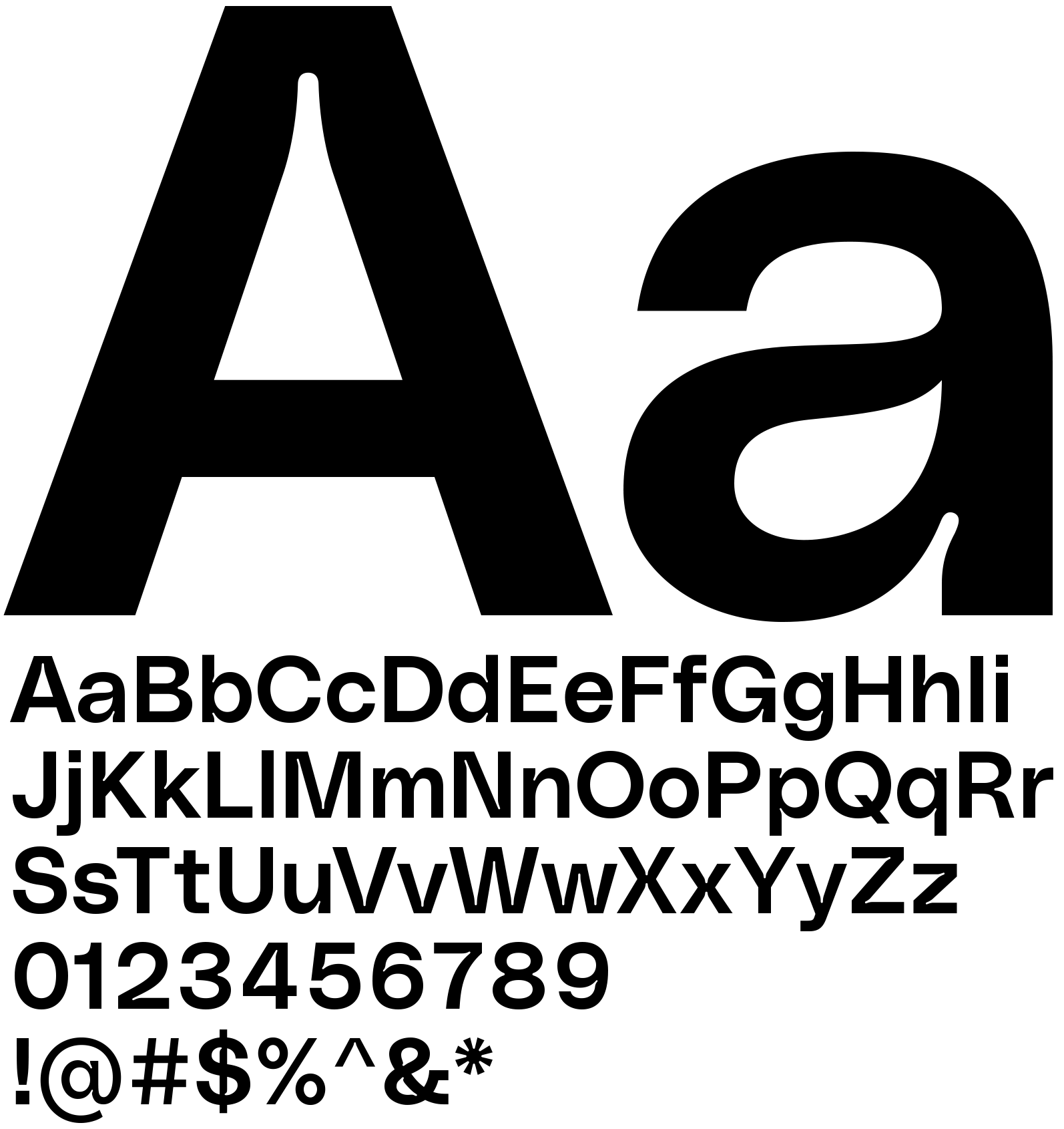
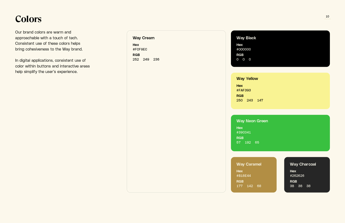
Color & typography
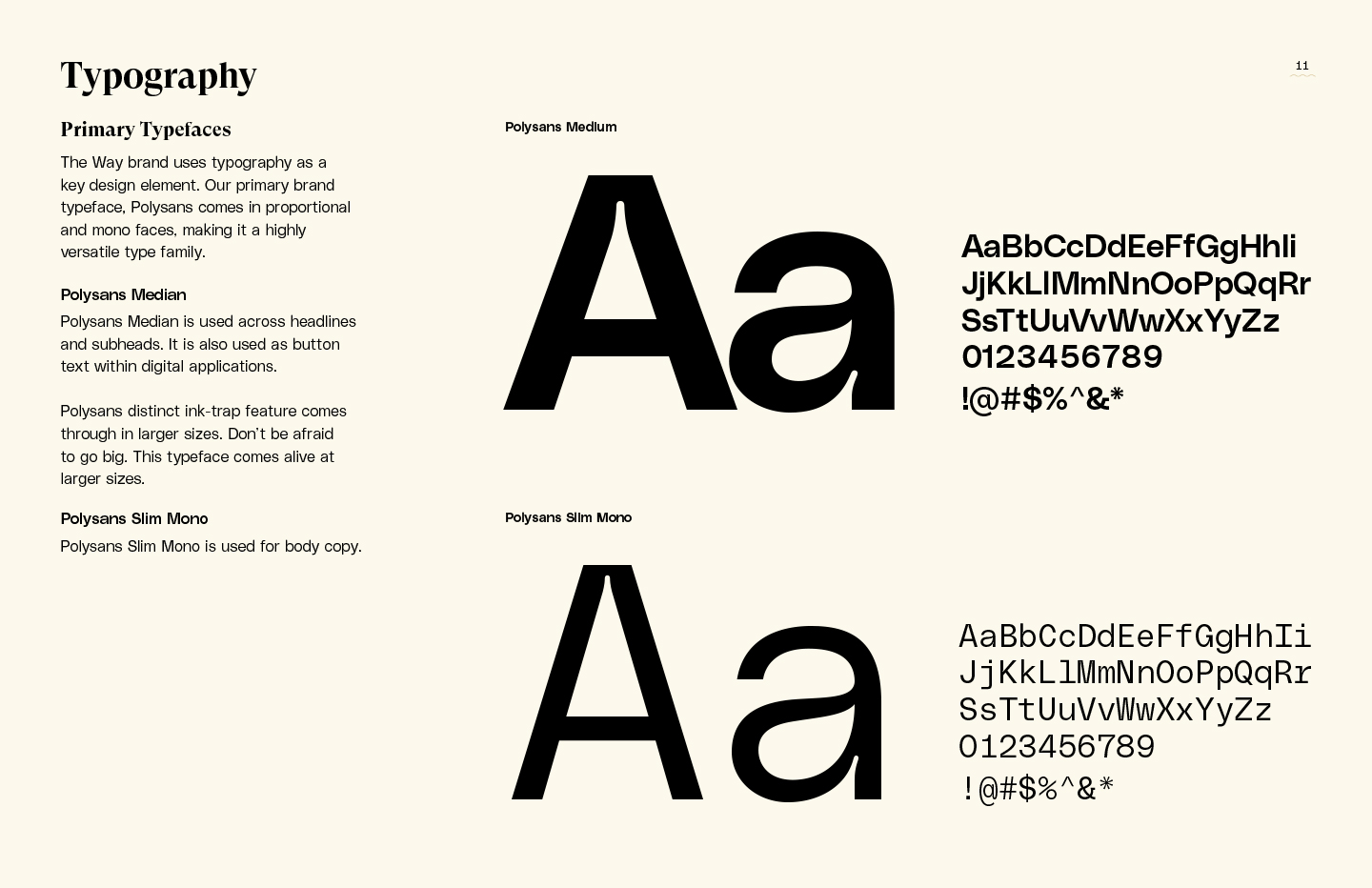
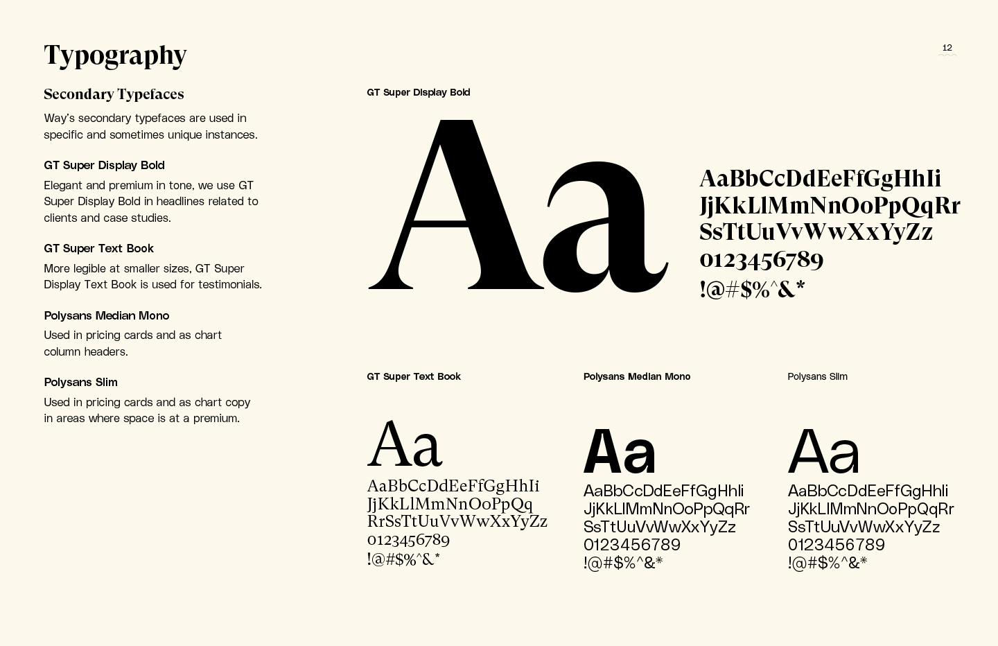
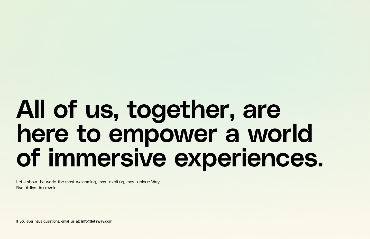
Leaning into the concept of tactile, sensory consumer experiences enabled through Way's software, we purposefully pushed away from white-dominated color palettes and straight forward sans-serif typefaces typically found with most SaSS brands.
Polysans
GT Super
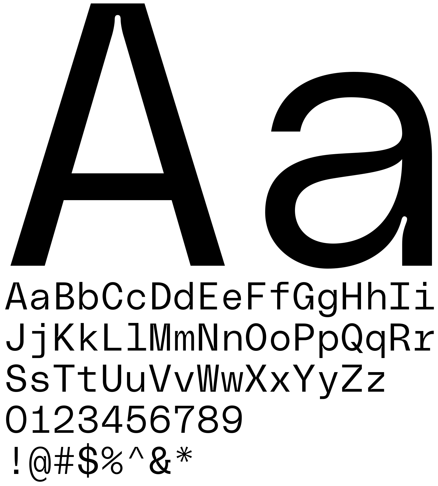
Polysans Slim Mono
Brand Guidelines
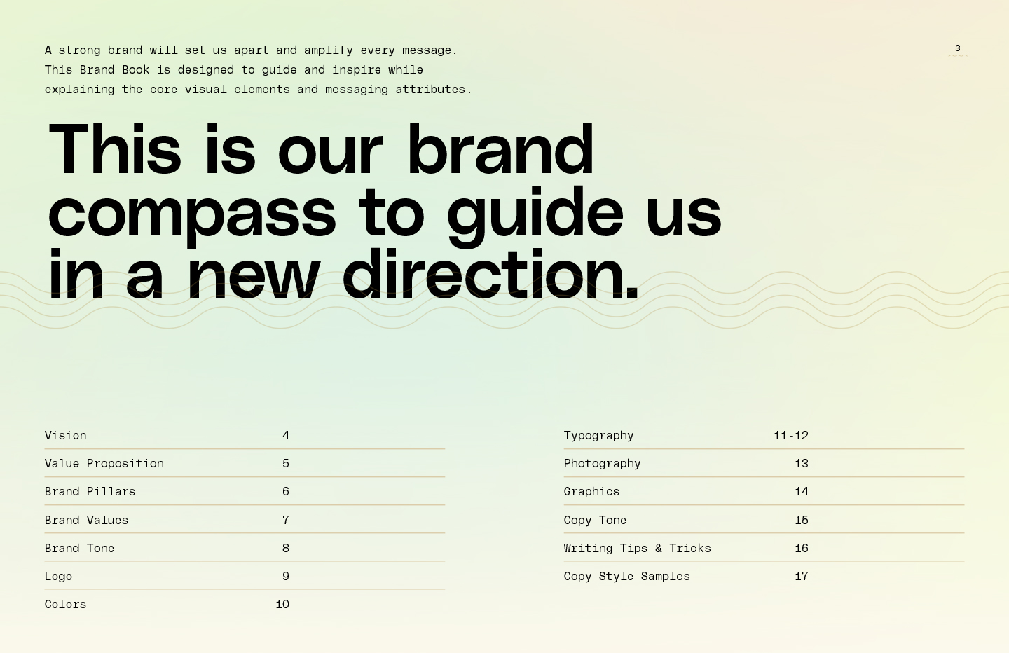
To wrap up the project, we delivered a brand book to help guide the team during their various growth stages.
All work © Hybrid Studio, LLC